Housing hopes: Will the souffle rise twice?
My previous post on house price data from the BIS (How to spot a housing bubble before it bursts, October 15) scotched one part of the ‘No Bubble Downunder’ case: Australia is one of four countries where house prices are more than twice as high as they were in real terms in 1985 (see Figure 1).
Figure 1: The Bubble Contenders
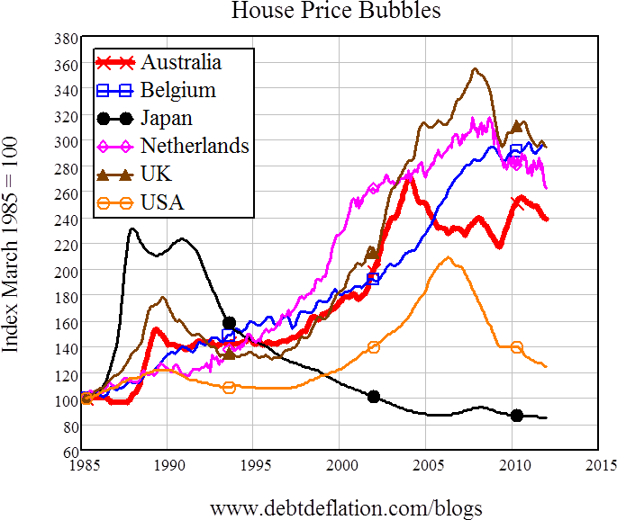
There may be others too of course, since the BIS data doesn’t go back that far for many countries (and as several Twitter correspondents pointed out, there’s something suss about the Canadian data that implied there is no Loonie Bubble ; I’ll follow up on that issue in a future post). On the BIS data (which stops in 2012), only Belgium still had rising prices – though we all know that Australia’s and the UK’s prices are now on the rise again, the latter thanks to the UK’s ‘Help to Sell’ program (the equivalent of Australia’s now largely defunct First Home Vendors Grant). But on the BIS data, Australia, The Netherlands, Belgium and the UK (in increasing order) are arguably unburst housing bubbles.
But rising house prices are only one half of the bubble formula: the other is the fuel of mortgage debt. House prices could well be rising because of “the fundamentals” – rising incomes, population inflow, rigid council building regulations, yada yada yada. But if they’re rising primarily because of accelerating mortgage debt, then we have a bubble.
The argument that rising private debt directly affects effective demand (in this case, for housing assets) is one of many that sets me apart from conventional economists. They generally ignore private debt, on the argument that, as Paul Krugman put it in his 2010 article Accounting Identities, “one person’s liability is another person’s asset, so rising debt made the world as a whole neither richer nor poorer”. My assertion that rising debt instead increased aggregate demand is rejected as double-counting – though recently Nick Rowe ‘got’ my argument, and rephrased it in his blog post What Steve Keen is maybe trying to say, in a way that I hope conventional economists will comprehend:
“Aggregate actual nominal income equals aggregate expected nominal income plus amount of new money created by the banking system… ,” Rowe said.
I’ll have more to say about that general topic in a future post, but for now I’ll stick to its application to house prices. Because the banking system creates new money by creating loans (a point that Paul Krugman now agrees with, though he disputes its significance), and because housing loans are used to buy houses, there’s a relationship between the flow of new mortgages and the level of house prices. So there’s also a relationship between the acceleration of mortgages and the rate of increase of house prices.
Think of it this way. For prices in any market to be stable, the flow of new goods being offered for sale has to equal the flow of new demand at the current price level. In most consumer goods markets, the flow of supply consists of newly created goods, while the demand is a flow of money from bank accounts – with most of that coming from the inflow of wages a short time earlier.
The housing market is different in two ways. Firstly, the flow of supply includes existing houses and well as newly constructed ones. Secondly, the flow of demand comes primarily not from income, but from new mortgages – since mortgages represent at least 70 per cent (and up to 95 per cent or more) of the buyer’s spending power.
So for house prices to be stable, the flow of new mortgages or the rate of change of mortgage debt – has to be roughly equivalent to the flow of properties for sale, at the existing price level. And generally speaking, for house prices to be rising, the flow of new mortgages has to be growing more rapidly than the flow of properties onto the market. There is thus a relationship between the acceleration of mortgage debt and the rise in house prices.
It’s not a rigid relationship – the acceleration in debt could cause a rise in construction or a rise in turnover as well, and income growth also has a role – and it works both ways: rising house prices can also encourage people into the market, thus causing mortgage debt to accelerate. But it’s one that conventional thinking about economics ignores on the “one person’s liability is another person’s asset” argument – and I argue that they are wrong to do so.
I’ve backed my argument with an appeal to the data, but before the Bank for International Settlements published its private credit database, my sample was restricted to just the US, the UK, and Australia. Now we can check this argument against eighteen countries – though unfortunately only with household debt rather than specifically mortgage debt.
I’ll look at three aspects of household debt: its level compared to annual GDP (which gives a measure of the debt burden households have to carry); its rate of change (again compared to GDP), which gives a measure of how much rising household debt is adding to effective demand; and its rate of acceleration (compared to GDP) which I then correlate to the annual change in real house prices.
Firstly, the debt level charts, which show that household debt has been rising across the world – except in those countries where the house price bubble has already burst (Ireland, Japan, Spain, the US and the UK until 2012). Speaking parochially, Australia’s household debt level just misses out of a medal behind the global champion Denmark, silver medallist The Netherlands, and bronze medal holders Ireland. The Irish however were headed for the gold before their bubble burst, with a staggering rate of increase of household debt from under 50 per cent of GDP in 2005 to almost 130 per cent in 2010.
Figure 2: Household debt levels (1)
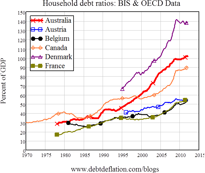
Figure 3: Household debt levels (2)
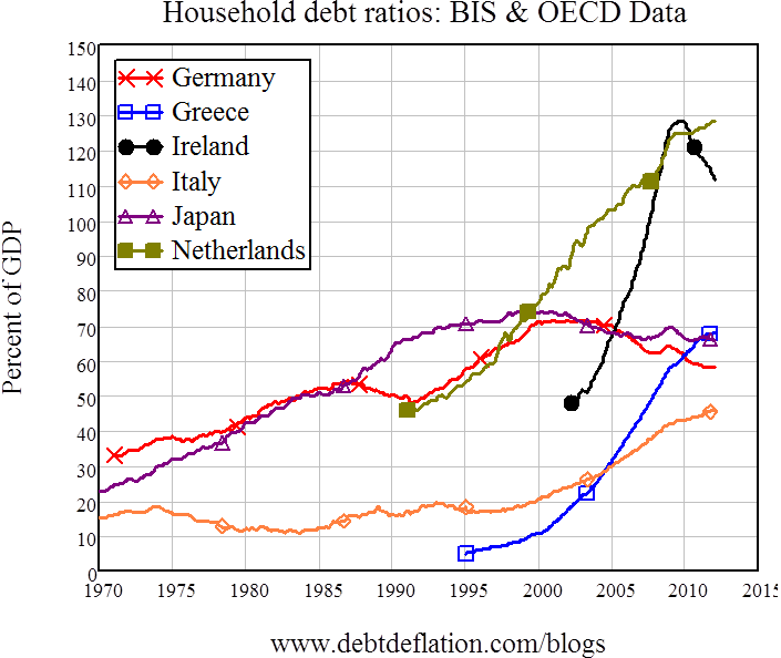
Figure 4: Household debt levels (3)
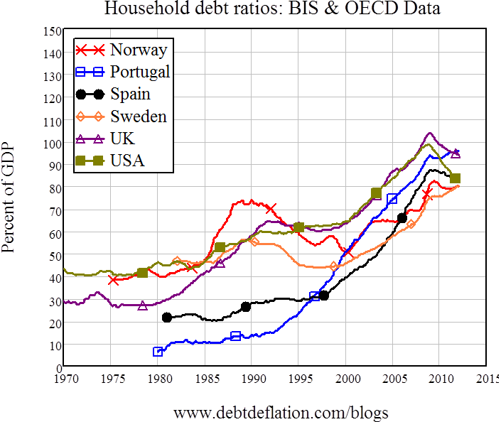
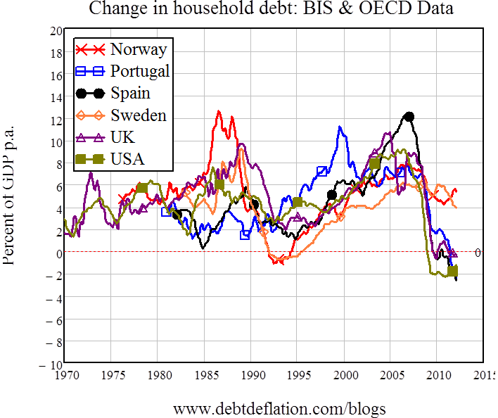
Now for the rate of change of debt: from my ‘erroneous double-counting’ point of view, how much was the change in household debt adding to aggregate demand? Here the standout performer – until its economy collapsed – was Ireland.
Figure 5: Change in household debt (1)
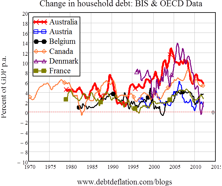
Up till 2007, the increase in Irish household debt drove demand 17 per cent higher than GDP. So much for Celtic Tigers – they were instead Celtic Debtors.
Figure 6: Change in household debt (2)
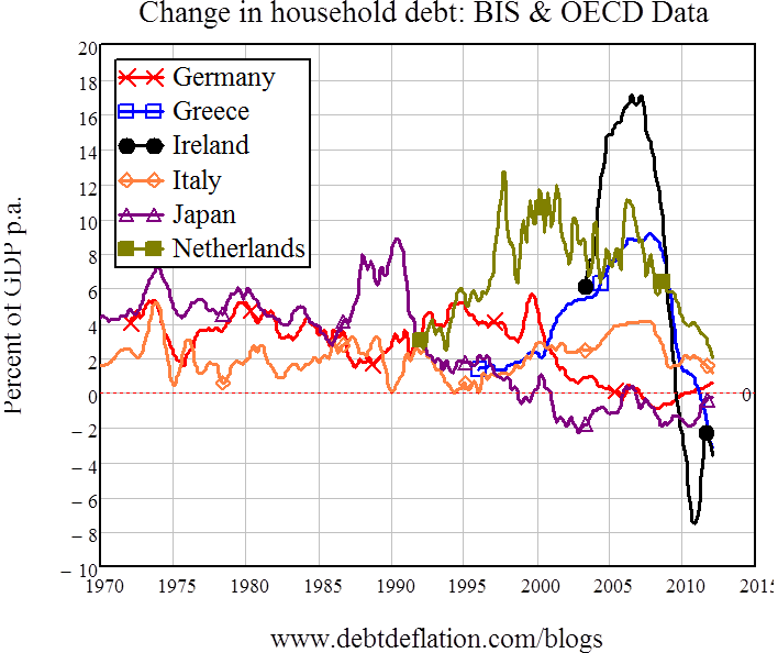
Honourable mentions go to Denmark (14 per cent per annum in 2006), Australia (13 per cent in 2004), and (12 per cent of GDP in 2007). But Australia – and Canada – share the interesting distinction at the end of the BIS data set (at the end of 2012) of having the highest post-crisis rate of growth of household debt (at just under 6 per cent of GDP per annum). This is way below the average for the period from 1990 till the start of the crisis, but it’s the highest in the world in the post-crisis period (or rather the post-onset-of-crisis period; I hope that global economic data is making it obvious to most that this crisis has become a fixture).
Figure 7: Change in household debt (3)
Finally, the ‘positive feedback’ relationship that I argue drives asset price bubbles: accelerating debt drives prices higher, while rising prices encourage more people to take out debt to enter the market. Following Biggs, Mayer and Pick, I approximate the acceleration of debt by considering the change in the change in debt over a year, divided by GDP at the midpoint of that year, and produce what they called the “Credit Impulse” and what I call the “Credit Accelerator” by dividing this by GDP. This is a very rough and ready measure (but it is needed to smooth out the extreme volatility of the monthly data), and before Biggs and friends did their analysis, I doubted that this indicator would be good enough to reveal the relationship I expected – especially since this is a correlation of a second difference in economic data with a first difference. But it turned out I was wrong: the correlation came through with Australian, US and UK data.
Now the BIS database allows me to consider those three and another 15 countries, and for the 15 for which there is more than a decade of data, only five have too low a correlation to argue that their prices are debt-driven: the expected cases of Germany and Austria, plus Italy and – unexpectedly – Portugal and Belgium. For the rest – including Australia – the signs of a debt-driven bubble are there.
Table 1: Household debt acceleration and house price change correlations (> 10 years data)
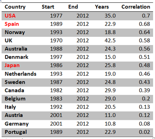
Table 2: Household debt acceleration and house price change correlations (<10 years data)

Ranked by the correlation coefficient, Australia sits between the acknowledged and burst bubbles of the US, Spain and Japan. So rather than being an exception – ‘House prices might be debt-driven overseas, but here it’s all to do with demographics and council regulations’ – Australia is part of the rule: rising house prices require (and cause) accelerating household debt.
So as well as walking like a duck (house prices are more than double), what they were in real terms in 1985), Australia’s house price bubble quacks like a duck (accelerating debt is the main driver). Next week I’ll consider what species of duck it is, by delving into the detailed Australian data on where the debt-driven demand is coming from.
Steve Keen is author of Debunking Economics and the blog Debtwatch and developer of the Minsky software program.


