Shares vs bonds: The pendulum technique
| Summary: Trying to pick trends is difficult, but historical data can provide some important clues to current and future trends. Focusing on the yield gap, or pendulum, is one system with a strong track record. If the pendulum is leaning solidly in one direction, either towards shares or bonds, then the odds are in favour of this asset class outperforming. |
| Key take-out: At June 30, the pendulum was leaning 16.5% in favour of the sharemarket yield. This would suggest shares remained undervalued in comparison to bonds. |
| Key beneficiaries: General investors. Category: Asset allocation. |
The 2012-13 year just didn’t seem fair to the average Australian.
72,360 people lost their jobs at the same time as the sharemarket achieved high double-digit growth in the vicinity of 18%. But what if someone said that this outcome was highly probable? In fact, so probable that it was a 100% certainty?
Can it continue? Or will the big bad bear turn its ugly head once more?
I will touch on the key driver of this anomaly below, and in the process will uncover the fruits of one of the best investment techniques that no-one seems to know.
Powerball and 11 year olds
Known mostly as a B-grade television show, ‘Are you Smarter than a 5th Grader’ has often surprised us with a child’s effortless awareness. It is around the age of 11-12 that kids are introduced to the basics of probabilities, and yet little would they realise that these teachings are some of the more important life lessons they will ever encounter.
This is best illustrated with an example. As a modern age teenager, some of our smarter kids can calculate that the odds of winning the Jackpot in Powerball are 76.7 million to 1. That is more than 3x our population and is low enough to turn almost any rational being off gambling. So why on Earth do we pursue such decisions with excitement and hope? Does no-one bother to assess their probability of success?
Unfortunately, the investment world is not seen any differently for a large chunk of Australians. All we tend to see is grey matter, clutter and sometimes hope.
The probabilities of doubling your money
So why not try clearing things up by using some basic probabilities?
Of course, the difficulty with investing is that it is not quite as simple as taking a batch of historical data, running it through Excel and finding out your chances of success tomorrow. If only it was so simple.
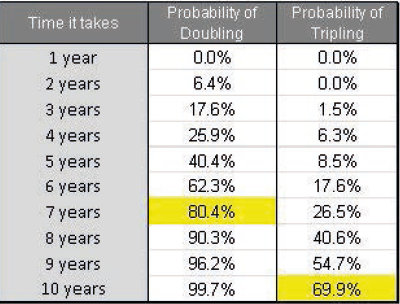
However we can all obtain an idea of what is “fair” or “excessive”. For instance, as an aspiring investor you may want to know how long it will take you to double or even triple your money (using 37 years of data since 1976).
There is no doubt that doubling your money has a nice ring to it, but never in history has the market doubled or tripled within one year.
Many would somehow be surprised by this. So let’s be more realistic. Seven years of patient investing gives you an 80.4% probability of doubling your money. Give it 10 years and you have a 70% chance of tripling it. Naturally, we like to think that some smart investing decisions along the way could fasten this process.
The truth is that too many people get swept up in the news headlines and don’t spend enough time looking at the wider picture. What are the probabilities of a blue-chip company going bust? How often will small companies outperform large companies?
Increasing the odds
It is widely agreed upon that there are multiple ways to “skin a cat” when it comes to investing. This creates opportunities, but the paradox of choice is an issue itself.
For a long time now I have advocated some of the better ones, including the Shiller PE, Zone System and the Buffett Economy; all of which have great track records and make theoretical sense. However, the one method that stands out above the rest is what I call the “yield gap” or the “pendulum”. The rest of this article will focus on this hidden gem and the evidence that supports it.
First and foremost, it is important that we all understand the metric itself. Here is my attempt to explain.
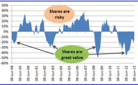
The easiest way to comprehend this “yield gap” is to think of a pendulum. On one side, we have a risky asset (shares) and on the other side we have a safer asset (bonds). We use the yields of these assets, namely dividends versus interest, and all we are looking for is to see if too much weight is being put on either side.
This “lean” or “gap” is evident worldwide and is what a number of the world’s best investors have been talking about for generations. According to my research, the first known mention of this pendulum-style analysis was in the 1950s/60s in a book called the Intelligent Investor by Benjamin Graham (possibly the best book an investor will ever read). To this day, it is still regularly referred to on the likes of CNBC and by reputable investors including Howard Marks.
If we focus on Australia and simply compare the position of this pendulum against our history, we can improve our judgements immensely. What we are looking for is an obvious sign that it is leaning one way or the other, away from its normal equilibrium. This part of the equation is not rocket science at all.
Let’s talk results
Despite the popularity, no-one seems to have systemised this approach until recently; at least not according to Google and definitely not in Australia. It was only a few years back that I wrote an introductory piece on this, and started with a handful of people who wanted regular updates.
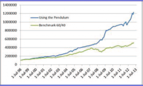
The “system” illustrates a very basic yet logical decision – if the pendulum shows that the share yield is more appealing than the bond yield, invest 100% in shares; the same applies vice versa. The results speak for themselves.
In fact, it is so compelling that on 96% of occasions this logical approach beats the typical benchmark over a five-year rolling period; with slightly less overall risk (standard deviation).
Doubters would argue that this is a form of prediction, but this isn’t about predicting the future. This is price versus value. It is all about valuing two completely differing assets and expecting that their biggest thing in common (the yield) will normalise at some point in the future.
The key difference between this analysis and much of that quoted in the media is that this method is more comprehensive.
Every “lean” is judged against the preceding 15 years of “leaning data”, which creates a situation that should provide a significant advantage for those who follow it.
In other words, it smooths the judgement because we aren’t just comparing Pete Sampras with Andre Agassi today. Instead, we are tracking the relationship between Sampras and Agassi over the previous 15 years, and then using it to help understand whether “Pistol” or “Andre” are better positioned today.
Of course, it isn’t fool-proof and there are some highly technical aspects to this metric which makes it extremely hard to follow as an everyday investor. But the lessons remain the same: be greedy when others are fearful and fearful when others are greedy.
Are shares or bonds better right now?
Using a consistent and seemingly dependable metric like this is particularly useful when assessing your asset allocation, but far less useful for stock-picking.
This, in a way, is part of its charm and complements any stock-picking analysis that you already do. On that basis, if we focus solely on the pendulum, at June 30, it was leaning 16.5% in favour of the sharemarket yield. This would suggest shares remained undervalued in comparison to bonds.
In other words, people are still fearful.
So, back to the initial statement about finding a 100% certainty … It turns out that whenever the pendulum favours shares by at least 18% and the underlying 30-day momentum is positive (as was the case at the end of June last year) the sharemarket has never delivered a negative return over the next year (including dividends, franking credits and growth). This really is quite astonishing given the 15-odd years of history it uses.
Unfortunately that boat has all but sailed, so we must look forward. As it currently stands, the “yield gap” or “pendulum” in its systematic form remains 100% invested in shares, with a 16.5% lean in its favour. This position has not changed since October 2011 (you may recall that market confidence was in the doldrums and the index was stuck in the low 4000s). With a total notional performance of 22.2% over the last year, it appears it continues to exceed all expectations.
Using a balanced opinion and a human head, it would appear imprudent to be investing 100% of your money in shares right now. Even I agree with that. But who are we to argue with 18.3% returns on a rolling 10-year basis?
This is an article which first appeared in the August 2013 edition of “The Investing Times” newsletter, which is published by Lachlan Partners and to which Scott Dixon is a regular contributor.


