Power demand and the race that stops a nation


It's the first Tuesday every November when the Australian nation supposedly stops to watch some four-legged entertainment for a few minutes in the afternoon.
We were asked what effect this had on electricity demand and, not immediately knowing the answer, we set about to have a look. What follows is some preliminary analysis:
1. Demand in Victoria
Starting in Victoria we step around each region to see what effect (if any) is discernable on the day – and at the time of the actual event.
The following chart shows the trend of demand over 13 years of history (up to and including 2013). Following Tuesday's race, we'd be able to add another year, but it seems as if there'd not be a whole lot of change if the past 13 are anything to go by?
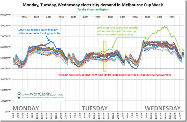
A few quick observations:
1a) Given that the Melbourne Cup day is a public holiday in most of Victoria, it was expected that we'd see demand lower on the day, compared with the days either side – however what was a little more of a surprise was the degree to which demand on Monday (i.e. supposedly a working day) almost matches that for Tuesday on each of the 13 years we looked at here. Does this suggest that there have been an awfully large number of people taking sickies on Monday (or more legitimate holidays) to make it a long weekend?
1b) Comparing Tuesday and Wednesday, we see that the day-time demand is more than 1000MW lower on the public holiday (a significant percentage of actual demand).
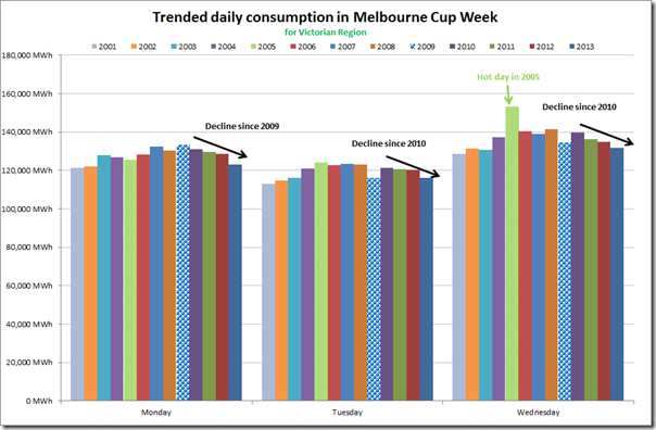
1c) Given the pattern of declining demand that we have discussed in numerous articles over a number of years on this site, we're curious what pattern might have been shown on each of the three days above. To make this pattern clearer, we aggregated the five-minute demand data to provide a view of total consumption over each of the days, and trended as shown. We see that the low demand in Tuesday and Wednesday 2009 appears an aberration (perhaps cooler than normal?) and that the pattern has been for daily consumption to decline since 2009:
1d) Finally, we do see (top chart) that there are some drops in demand around 14:00 (NEM time) on race day – which could be taken to mean that some production processes temporarily stop for the race – however, when seen in context to demand over the three days, it does not appear an out-of-the-ordinary drop.
2. Demand in NSW
Heading north to the most populous state, we perform the same analysis to see what we find.
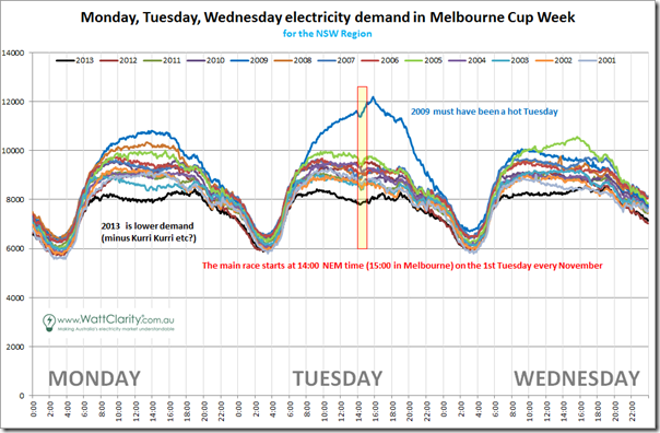
Again, some quick comments:
2a) What's most striking in this chart is the shocking level of demand seen in NSW on the cup day in 2009, following a smaller blip on the Monday earlier in Victoria. A quick search finds this article that talked about a cool change forecast for that year's race in Melbourne, so it seems to be temperature related.
2b) Only slightly less striking, compared to what we see in Victoria above, is the much greater degree of variability seen in NSW demand across all years (whereas lines for Victoria lay much more on top of each other). When aggregating data across each of the three days and trending over time, this leads us to expect we might see more randomness – but the same type of pattern as in Victoria is seen here, with daily consumption declining since 2009:

2c) Compared with the same chart for Victoria, we see what looks like a much more significant drop in 2013 – with first suspicion being that this is the result of the closure of Kurri Kurri aluminium smelter.
2d) Finally, it is worth noting that the first chart for NSW shows clearly visible drops in demand around 14:00 – i.e. at the start of the race (presumably when everyday workers “downed tools” temporarily to engage in the national pastime of pretending to be horsing experts.
3. Demand in Queensland
At the top end of the NEM, we include the same chart for the Queensland region:
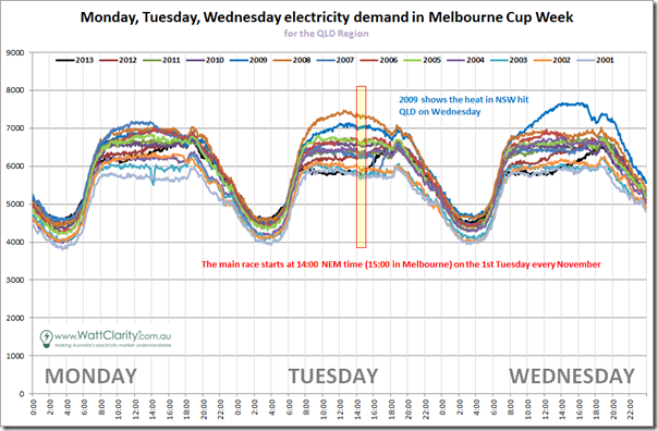
We've run out of time to analyse (or comment) in any particular detail, but suffice to say that any drop around 14:00 on Tuesday seems much less visible in the above.
4. Demand in South Australia
Back down in the south-east we include the same chart for South Australia:
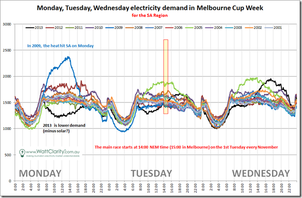
In SA we can see a drop for 2005 – partly because that (hotter) day stands out from the pack on Tuesday.
5. Demand in Tasmania
Here's the same chart for Tasmania.
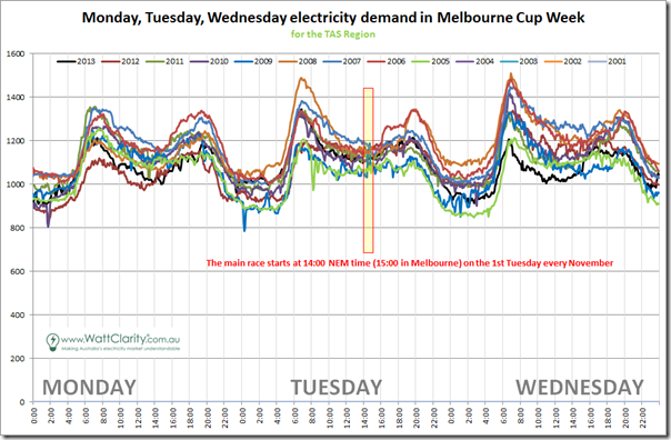
In Tasmania the compact clustering of the chart at 14:00 Tuesday makes it difficult to see anything in particular. What is more noteworthy, though, is the pronounced morning peak in demand.
All of this does leave the last question begging, however: which horse will win?
Paul McArdle is the Managing Director of Global-Roam, an energy market analysis software provider.
This article was originally published by WattClarity. Republished with permission.


