Many metrics don't change a housing consensus
As housing prices have boomed over the last decade, there has been much discussion over what constitutes accurate measures of property valuation and affordability. Unfortunately, this debate is coloured by the varying data sources and methodologies used by individuals and organisations. To add to the confusion, interpretation of what the metrics mean varies just as widely.
The Economist’s popular interactive housing graphic provides a range of metrics for many countries, including Australia. It compares housing prices to a couple of economic fundamentals: inflation, rents and income, providing a convenient tool for examining relative valuation. These metrics are important in helping to assess whether the Australian residential property market is overvalued or not.
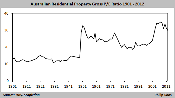
Possibly the most important metric is the price-to-rent ratio, or P/E ratio in common stock market parlance. In an efficient market, property values are derived from a capitalised stream of rents, net of land tax and rates. Housing prices and rents are mirror reflections of each other, viewed from a different perspective. When housing values are determined by underlying fundamentals, then prices and rents should tend to track each other.
Understanding this is critical, as economist Dean Baker wrote in 2002 when he identified the US bubble and predicted the subsequent Global Financial Crisis. He reissued warnings again in 2004 and 2005, noting “No one can produce an explanation as to how fundamental factors can lead to a run-up in home sale prices, but not rents.” It was obvious to Baker back then that the divergence between prices and rents was not due to the fundamental workings of the economy.
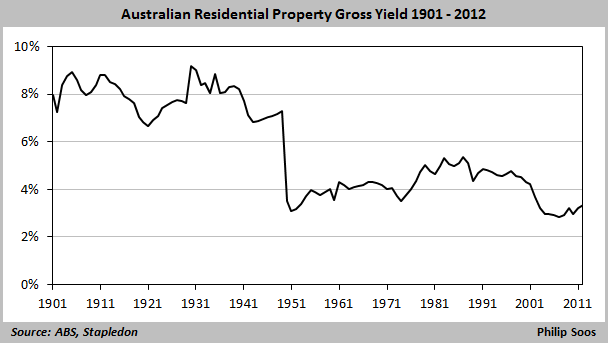
As The Economist’s graphic shows, the P/E ratio reached its highest point on record in 2007. An even longer time series derived from the work of economist Nigel Stapledon confirms this. Put another way, the P/E ratio is the inverted gross yield, falling to its lowest point in the same year. Since then, a strong increase in rents through rising population growth (net immigration), the mining investment boom and terms of trade has partially corrected the glaring divergence.
Another popular metric is the price-to-income ratio, as median prices (numerator) tends to increase against household income (denominator) during a housing boom. The Economist’s ratio, however, uses average income, essentially an apple to orange comparison that should be discarded in favour of median incomes. As with the P/E ratio, it shows a rapid escalation during the early 2000s, remaining fairly stable, then peaking in 2010. The aforementioned drivers of income growth have likely moderated the ratio.
The RBA’s preferred price-to-income ratio is a rather low four to five. Initially I asked for the data used to compose this ratio, but was denied on the basis of proprietary data. Using the Freedom of Information Act, I managed to obtain the denominator which was constructed from ABS data, but not the numerator, from research firm APM. The Reserve Bank's measure of income was a joke, claiming that by 2010, the median household was earning approximately $100,000 a year.
The 2011 Census showed median household income was around $65,000, a big difference. Economists Leith van Onselen and Cameron Murray lodged a request for the Reserve’s household income methodology. They found it included superannuation, imputed rents and insurance claims, accounting artefacts that cannot be used to finance the purchase of property.
Demographia’s ratios are more realistic, but it would be useful if this organisation could provide detailed methodology and data. Thankfully, the Reserve Bank appears to have rethought this issue, providing a detailed analysis in a recent release. A number of ratios are calculated using differing data sources, concluding Australia’s is close to seven as of 2010, a significant increase over its previous ratio.
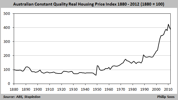
The remaining metric The Economist uses is comparing nominal housing prices to inflation. If there is a wide divergence between housing prices and inflation, this suggests people consider housing to be relatively more important to the basket of goods and services that comprise inflation. The long-term trend demonstrates a significant divergence, with real housing prices booming by 123 per cent between 1996 and 2010.
There are a number of other metrics used to analyse property valuation, for instance, aggregate land values/housing stock/total property sales to GDP/GDP per capita – all of which show a substantial run-up since 1996, collectively peaking in 2010. Despite the confusion caused by varying data and methodologies, it is evident Australia’s housing market is overvalued.


