Is sharemarket volatility so far this year normal? No


It’s a ghastly feeling when the local share market loses 2% in one day. Since the start of this year it’s happened twice. To understand whether it’s something to worry about investors can look backwards and compare recent volatility to past averages. Let’s have a look.
The first chart shows the frequency of daily returns for the S&P/ASX 200, with the red bars going back to the beginning of 2015 and the blue bars showing data for this year, up to Wednesday February 3, when the index was down more than 2% during the day.
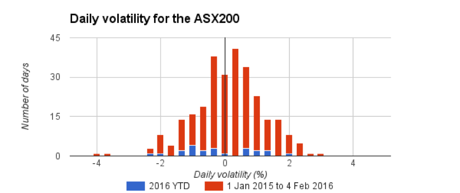
For the past 13 months, the data is bunched together in a symmetrical hump. Anyone who remembers a bit of high school statistics might recognise it as similar to the "bell" shape of the normal distribution, which is seen as a “best fit” for many observations in nature. Whether or not the normal distribution is a best fit for price data in the investment markets is well beyond the scope of this piece, and we’ll leave that to the scientists of finance (or “quants”, as they’re known).
A ROUGH START TO THE YEAR
The short blue boxes along the bottom are the daily movements for the 22 trading days this year to February 3. The red and blue bars combined show the 276 trading days for the past 13 months.
The flat distribution of the blue bars shows the market has been more volatile than usual, if we use the past 13 months as a benchmark. It’s been a rough start to the year.
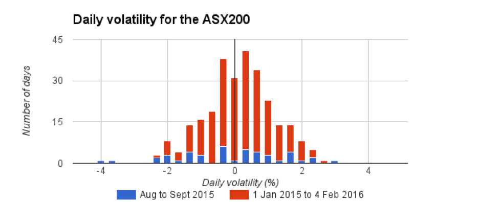
BUT WE'VE SEEN WORSE
Investors have seen worse in recent times. The second chart compares the same 13 months of market activity with August and September 2015, a particularly volatile couple of months which included one daily drop of 4%. The blue bars, which show the distribution of daily returns for August and September, are spread pretty flat — evidence of heightened volatility.
OPPORTUNITY OR WARNING
The past 13 months have been a harsh environment for local stocks. The third chart shows average daily price movements variance for the three periods compared above. The price variance number describes the spread of the distribution of the data. For periods where the daily price volatility has shown a flatter distribution than expected, the daily variance will be higher.
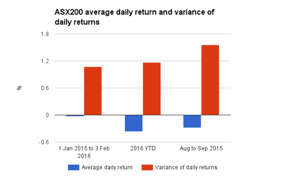
For the past 13 months, the index has lost an average 0.0318% a day. So far this year, it's lost an average 0.3675% a day.
The variance in returns, or standard deviation, has also increased dramatically. For the past 13 months it's been 1.0781%; so far this year it's been 1.1691%.
Yes, the market is more volatile than is usual. The August to September period last year was more volatile, but the average daily loss was not as bad as recent weeks — negative 0.2819% compared with negative 0.3675%.
RISK REDUCTION
It’s not all doom and gloom, of course. Every portfolio should include a range of asset classes so that risk is reduced. It can never be completely removed, unless you only hold cash, but it’s been shown that investors who accept volatility in equities markets will benefit from including them in a portfolio over the long term.
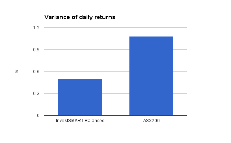
The InvestSMART Balanced model portfolio includes Australian and international equities, listed property, bonds and cash. It’s performance is tracked daily, just like the ASX200, and a comparison with the ASX200 of average daily volatility for the past 13 months — shown in the last chart — is proof that professional portfolio construction works.


Frequently Asked Questions about this Article…
No, the current share market volatility is higher than usual. The past 13 months have shown more volatility compared to historical averages, with recent daily losses averaging 0.3675%.
Recent market volatility is significant but not unprecedented. The August to September 2015 period was also volatile, with a daily drop of 4%, but the average daily loss was less severe than recent weeks.
A 'bell' shape distribution, similar to a normal distribution, suggests that most daily returns are clustered around the average. However, the current market shows a flatter distribution, indicating increased volatility.
Investors can manage risk by diversifying their portfolios across various asset classes, such as equities, bonds, and cash. This approach helps reduce risk while still allowing for potential long-term gains.
The variance in market returns, or standard deviation, indicates the spread of daily price movements. A higher variance suggests greater volatility, as seen in the recent market activity compared to the past 13 months.
Yes, including equities in a portfolio can be beneficial over the long term. While they introduce volatility, equities have historically provided growth opportunities that can enhance overall portfolio performance.
The InvestSMART Balanced model portfolio includes a mix of Australian and international equities, listed property, bonds, and cash. This diversification helps manage risk and has shown effective performance even during volatile market periods.
During periods of increased market volatility, investors should focus on maintaining a diversified portfolio and staying informed about market trends. This approach helps mitigate risk and positions investors for potential long-term gains.


