Inside a market time warp
| Summary: Comparing the Nasdaq Index between 1996 and now with the Dow Jones from 1921 to 1955 brings up some remarkable pattern similarities, and could signal the market is about to boom. But a comparison with other historical indices shows we could be on the edge of an abyss. The problem is, working out where we are precisely is purely guesswork at this stage. |
| Key take-out: The prudent course of action is to hope for the best, yet have a clear exit strategy “just in case”. |
| Key beneficiaries: General investors. Category: Shares. |
Robert Dillon, an American market timer, is a firm believer in stockmarket patterns being a pointer to the future.
I prefer trend and momentum indicators to generate my signals since I think patterns are a pseudo-science without empirical backing.
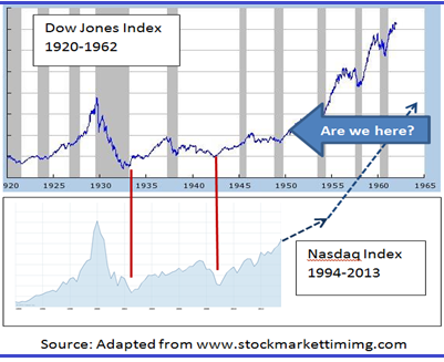
But Robert has intrigued me with his comparison of the US Nasdaq index since 1996 (which has tracked the fate of information age companies) with the US Dow Jones Index between 1921 and 1955 (which recorded the destiny of industrial age giants). To my knowledge no-one else has picked up on this similarity.
The time frame for each chart is different, with the Nasdaq for the last 17 years broadly tracking the Dow Jones for the 29 years to 1950. But pattern analysts look for pattern repetition rather than matching of duration and amplitude. And, on that score, there is an uncanny resemblance between what happened in the Roaring 20s and the Great Depression leading through the Second World War and what occurred in the Soaring 90s to the Dot.Com Bust and subsequently the Global Financial Crisis.
It’s heartening to know that if the market mirrors the swings it underwent through the 1920s, 30s and 40s (i.e. bull/bear/bull/bear/and finally bull-take-off) then we have now reached the base camp of the next secular bull market that could resemble the ascent of Mt Everest.
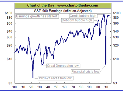
Certainly US inflation adjusted S&P500 earnings up to the June quarter 2013 shows that American big business has recovered from the financial meltdown of 2008/09 when profits plunged as deeply as they did in the 1920/21 recession. So the GFC should be well and truly behind us.
But Robert Prechter, of Elliott Wave International, points to another historical comparison that would suggest America’s stockmarket is on the cusp of a crash much worse than 2008. His charts reproduced below suggest a strong similarity in the movement of the Dow Jones index (whether expressed in nominal or real terms) over the last 13 years with that of the seven years from 1965 to 1972. According to Prechter, the market will now trace out what happened between 1973 and 1982, though it could take twice as long to do so.
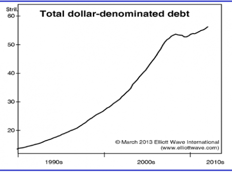
Prechter says a collapse will come about because total American debt (public plus private) has lost momentum due to a “subtle shift in lenders’ and borrowers’ psychology from record ebullience towards conservatism”, which has “caused economic stagnation which affects debtors’ ability to repay.” One result is the recent stalling of America’s home price recovery.
So who is right? Are US share prices about to climb the stairway to heaven or descend to hell? That question is important because America’s stockmarket is the bellwether for other markets, including our own.
Frankly it’s impossible to foretell the future so the prudent course of action is to hope for the best, yet have a clear exit strategy “just in case”.
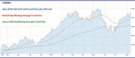
One way to do that is to monitor whether the Australian All Ordinaries share index’s medium-term trend (its 50-day moving average) stays above its long-term trend (its 200-day moving average). You can do that on any share charting platform including Yahoo7 Finance (http://au.finance.yahoo.com/q?s=^AORD). If the share index’s red medium-term trend falls below its green long-term one, abandon the market (or at least sell half your stocks or equity funds) until it recuperates.
Another approach is to compare the percentage movement of the SPDR S&P/ASX 200 Share Fund (ASX code STW.AX) with that of the BetaShares Bear Share Fund (ASX Code: BEAR.AX) on a rolling 12-month basis. The Bear Fund is an inverse ETF, meaning that it rises when the market falls and falls when the market rises. Should the annual momentum of STW be overtaken by the annual momentum of BEAR, then exit the market or go short by buying the BEAR Fund.
I use more sophisticated tools than this to trend-track individual exchange-traded equity funds or rotate between different asset-class ETFs to take advantage of their relative momentum (i.e. rate of change), but the two examples above illustrate that there are ways you can self-insure against a crash while always participating in a boom.
Percy Allan is a director of MarketTiming.com.au. For a free three week trial of its newsletter and trend-trading strategies for listed ETF funds click here (www.markettiming.com.au).

