For utilities, confusion is profit
This week I bit the bullet and responded to my electricity retailer’s TV advertising by signing up for their online monitoring program. I figured it was worth taking a look at what they were offering and how it would “help me understand my energy use and costs.”
Well, I’m sorry to say (Energy Australia) that I’m pretty disappointed. Your eWise program should really be called eSales.
The good
To be fair there were some things I did like. Being able to see my historical consumption, compared to other homes and how it relates to temperature is great, and I could export some of the data to excel which is excellent.
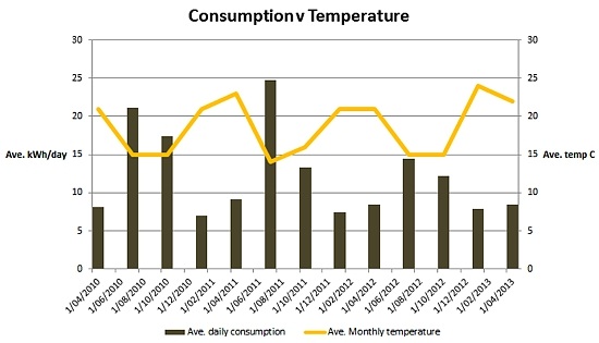
In itself, the best thing is that my intuitive sense that we use more depending on how cold it is was borne out by a nice graph. Being in an old home with huge windows is great but it leaks like a sieve. I pretty much knew this, but seeing the quantum will help me to ‘negotiate’ at home with the primary power users…
I’ve extrapolated the data and shown it below.

Secondly, I was delighted to get through to the call centre quickly and got to intelligent, well trained, helpful and interested staff. Very well done on that score. Optus could sure take a few lessons from them on that one.
I spoke to a couple of folks (actually, thoroughly interrogated would be a better term), got some clarifications and gave them some feedback and they were genuinely interested in what I had to say it seemed. One kind chap even offered to get some additional granularity and send me an email to answer some questions for me between calls. He also highlighted that the system is a work in progress and feedback was very welcome so they could improve it – which I think he regretted saying by the time I was done with him.
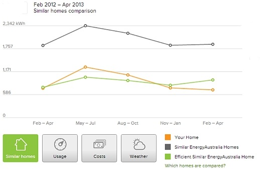
I also liked the fact that I could compare my usage to other similar homes in the area which was theoretically based on similar consumption and behaviour styles. It showed that we were better than the average home all year round (almost 50 per cent better in some months!) and even better than an energy efficient home in the summer months (but not winter). I felt all warm and fuzzy.
The bad
I must admit, however, that after taking a real good look around and getting some background on Energy Australia’s system, I am not convinced that helping me or being transparent about what my bill is made up of is their main aim at all. In fact, I’d go so far as saying what they are showing is carefully manipulated to avoid showing me several things that would scare the lights out of Joe public and irritate the hell out of me. I was left with the distinct impression that the whole aim is to show me a small amount of information and up-sell me on a whole heap of other things – eSales.
Firstly, there was the costs analysis. This is profoundly lacking in detail. I am on Time of Use and it does not break down my consumption so I can’t see how I might alter my demand profile, which is the single largest factor in my cost structure. They know it, I know it and hiding it is deceptive. You have the data Energy Australia and you sure as hell bill me at a TOU rate, so you might want to fix this.
Secondly, there was the ‘cost’. Apart from concealing my demand profile charges, it also conveniently left off daily charges which add a substantial amount to my monthly bill. In fact, a quick analysis showed that it currently makes up around 30 per cent of my typical bill which I can do almost nothing about (which I’m sure is the reason they don’t show me). However, I’d really like to know what I can affect and how they relate and how they are changing over time (which I’m sure is the reason they don’t show me). So once again, they are hiding what really makes up my energy costs and preventing me from seeing how this has changed over time, which would make them look bad.
Additionally, it doesn’t mention my rates. Anywhere at all. So I can’t see how electricity prices have changed over time or how my costs are affected by rate changes.
It might just be me, but frankly I am increasingly frustrated by companies thinking it’s perfectly okay to charge me for products or services and then disguise what they are charging me for. Is it just me or is this increasingly common trend just completely outrageous?
I am boggled at the number of offers that I waste time on trying to understand what I’m being charged for or in the case of telcos, being charged for services I don’t even use because of ‘rounding’ (eg data time bundles). What a crock.
Thirdly, I’m one of several hundred thousand folks in NSW with a solar system. I installed it to help reduce my bill and reduce my consumption. And yet, Energy Australia doesn’t provide this information as part of the analysis.
I know Energy Australia collect the data and it would show how PV has helped make a huge difference to my costs and how I might optimise my generation to consumption behaviour. By not showing that, they are offending my personal investment, hiding the benefits that I know are real and preventing me from making decisions based on enhanced information. The only reason I can see that they would do that is because the benefits are to me and not to them.
Seems a little harsh? Well, I tried their energy tips section and you know what? Solar is not listed as an option or a suggestion. Anywhere at all.
That’s nothing short of deceptive and offensive to a solar user. Here’s a tip Energy Australia – there are now one million solar users in Australia and it’s still growing so you might want to rethink that strategy.
Fourth, the ability to export and play with the data was there through an excel export function, but again it limited what I could see – so didn’t end up being much use. All the data is there, so sure, sanitise it for the website if you must, but dumping it into a database and letting me go wild would cost little if anything more.
Last and most annoyingly there was the ‘energy reduction tips’. Yes, there were some good tips for Joe public. However, they were all pretty basic and commonsense based and I would suggest that anyone who goes to the trouble of looking at graphs and data would be well aware of them already.
I was also surprised to see that energy audits didn’t make the list. I did get excited when I saw an in-house display listed as being a great way to reduce consumption but when quizzed, it turned out Energy Australia doesn’t actually provide them or offer advice on them.
I’m excited about the possibility of information helping me to control my demand and keep costs under control and at first I thought Energy Australia might be going to help me. Pilot trials, reports and studies all show that information is a key to helping consumers in this way.
However, what I found was a manipulated data set that didn’t tell the full story, disguised the costs, ignored my existing efforts and was too dumbed down to be much use.
It also demonstrated a lack of willingness from Energy Australia to actually provide solutions (beyond tariffs and loyalty deals) and this is the really important bit. For utilities to evolve, they have to learn how to sell energy savings, not just energy. It may just be that this is stage one of a platform that will enable them to do just that but for now, the message seems to be pretty consistent – ‘confusion is profit’.

Nigel Morris is the director of Solar Business Services.
This article was originally published by SolarBusinessServices. Republished with permission.


