A sudden conversion of property bubble doubts
Back in the Olde Days, before the global financial crisis, when I was one of a handful raising the alarm, some of the most strident opposition to my opinion about what this might mean for housing in Australia came from Christopher Joye (who was then a Director at Rismark). We went head to head on many occasions, with me arguing that our prices were a debt-fuelled bubble, and Joye arguing that rising house prices simply reflected rising household incomes.
Fast forward to today, and though house prices have not done what I expected (see I will be wrong on house prices, November 12, 2013), one of the most prominent commentators asserting that there is a dangerous house price bubble in Australia is… Chris Joye (who is now a writer for The Australian Financial Review. There are also many others who were once on the “no bubble” side of the argument who are now warning that there is one.
I’m delighted by this shift of course, but it does beg the question “what has changed -- the facts, or the commentators?” The answer, as in most things, is a bit of both -- but I think more the commentators than the facts.
Firstly, the issues that I highlighted as causes for alarm -- the level of household debt and the ratio of house prices to incomes -- are the same ones that Joye and others are now using to saying that we’re in a dangerous bubble. Secondly, the levels of those indicators are much the same as they were in 2010. So back in 2010 these indicators weren’t a problem, and now they are?
For example, in June 2010 Joye put out a press release that was quite blasé about a house price to income ratio of 4.7:
“Australia’s home price-to-income ratio has fallen slightly from the (upwardly revised) 4.7 times estimate as at December 2009, and is a little higher than the average ratio since December 2003 of 4.4 times… In contrast to claims that Australian home prices are seven to eight times incomes, Rismark’s analysis suggests that the true ratio across all regions and all dwelling types is nearly half this estimate. This in turn implies that Australian housing is not as expensive as is commonly suggested (Release: Australian home prices 4.6x disposable household incomes, June 4, 2010).”
So back then, a price to income ratio of 4.7 was not a problem. But last month, a lower ratio of 4.4 times was a problem, Joye argued:
“The $4 trillion Australian housing market is now overvalued by at least 10 per cent. Every day, valuations get more stretched. Indeed, Australia is just months away from having the most expensive residential property market in history… Taking the latest price data and assuming recent income growth rates, we get a price-income ratio of 4.4 times as at end March 2014. That is, 1.7 per cent off the peaks. Valuations are already 10 per cent above the average since 2000 and 20 per cent beyond than the benchmark since 1993 (Property prices headed for record high, March 28, 2014).”
Similarly on the level of mortgage debt, back in 2010, this wasn’t a problem:
“When we only analyse home owners with mortgage debt, the average value of that debt relative to the value of their homes is about 50 per cent. Australia’s largest lender, Commonwealth Bank, has actually disclosed that the average LVR across its mortgage book is much lower -- around 34 per cent if I recall correctly. Okay, so this tells us that the absolute debt levels are not particularly high… (Deconstructing Steve Keen, February 24, 2010).”
Last week, they were critically high, according to Joye:
“Australian household debt has hit a record 177 per cent of annual disposable income while housing valuations are "flashing red", according to Barclay's chief economist, Kieran Davies (Australia's house prices 'flashing red', debt to income ratio at record levels April 4, 2014).”
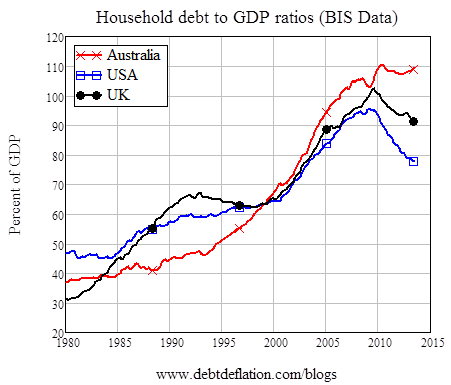
And yet household debt is only marginally different to its level in 2010: using the excellent new BIS data set, Australia’s household debt level is now 109.4 per cent of GDP, which is 1 per cent below its 2010 level (though it’s also been the highest of the lot since 2000, and the US and UK have seen substantial falls since 2010 while Australia has flatlined).
Figure 1: Household debt levels in the Anglo zone
So these facts haven’t changed -- but Joye’s interpretation of them has. And are there any other facts that have changed that might explain the change of heart?
I can think of one: the relationship between house prices and disposable incomes. Joye’s mantra all through our debates some years back was that changes in house prices merely reflected changes in disposable incomes:
In May 2010 he wrote: “What we said - We have been forecasting a cooling in capital growth rates back down to single digit levels since October last year. Australian disposable household incomes rose by 11.5 per cent in 2009 -- unsurprisingly, the cost of housing increased by almost exactly the same amount. In 2010, disposable household income growth will be less than 5 per cent. Over the long-run, residential property values track purchasing power quite closely…
“What happened – In 2010 house prices grew by 5 per cent , which was broadly in line with year-on-year disposable income growth (Benchmarking our historical house price forecasts, May 29, 2011).”
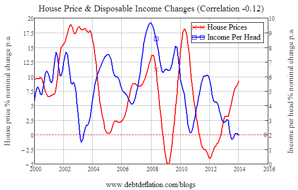
This argument -- that house price changes merely reflect changes in disposable incomes -- hasn’t held up well. Using ABS house price data and the Reserve Bank data on disposable income (Sheet G12, column T, divided by population), in the period from 2008 till 2010 the correlation was plus 0.67, and this appeared to support Chris’s theory. But over the whole period from 2000 till today, the correlation is actually negative 0.12 (see figure 2).
And as Joye acknowledges in recent articles, house price growth is accelerating now as disposable income growth is falling:
“Australian dwelling prices have jumped more than 10 per cent over the year to March 2014. In Sydney and Melbourne, which make up 55 per cent of the metropolitan population, home values leapt by 15 per cent and 11 per cent, respectively. Yet disposable incomes per capita only rose by 1.7 per cent over 2013 (Property prices headed for record high, March 28, 2014).”
This is sending the house price change and disposable income change correlation deeply into the red: from 2011 till now it is minus 0.9. That is a drastic change of facts.
Figure 2: Negative correlation of change in disposable incomes & change in house prices
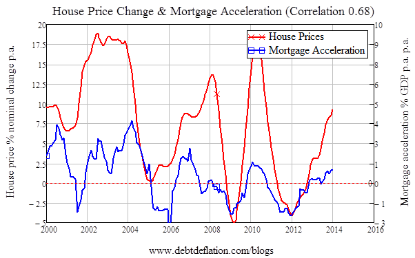
My alternative model was that house prices followed changes in mortgage debt -- and more precisely, that changes in house prices were driven by the acceleration of mortgage debt (this was a macroeconomic argument that I’ve since formalised -- see here). Though history hasn’t been kind to my expectations of house prices changes in Australia, it has been kind to my theory as to what drives them. The correlation between the acceleration of mortgage debt and change in house prices over 2000-2014 is 0.68 (see figure 3). And while disposable income growth is falling how, the acceleration of mortgage debt is increasing -- and the correlation from 2011 till now between mortgage acceleration and house price change is an even stronger 0.89.
Figure 3: Correlation of mortgage acceleration & change in house prices is 0.68
So perhaps Joye’s welcome change of tune is a reflection of Keynes’ classic statement that “when the facts change, I change my mind. What do you do, sir?” (Maybe we should have a beer over this, Chris.)
For my part, my change of expectations about house price rises -- which I now expect to see continue for some time, thanks to the combination of the speculative buying frenzy by “investors”, self-managed super fund levered purchases of property, and non-resident purchases -- reflects another of Keynes’s famous aphorisms, that “the market can remain irrational for much longer than you can remain solvent.”
But when mortgage debt growth turns south, my message is the same one Joye finished with recently: “buyer beware”.
Christopher Joye has written a response to this article in the Australian Financial Review.
Update:
Chris has since clarified that the figures he published in 2010 and those cited this year are based on two different indices. I’ve derived the following table from Chris’s email:
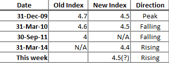
Chris concluded in his email that:
“Since mid-2013, I have correctly forecast that the house price-to-income ratio would **rise** and breach its all-time peak of 4.5 times (on the current index). This is exactly what has happened -- and the ratio continues to rise, which explains my concern!”
This implies that this week’s level has cracked 4.5 -- which I’ve included in the table -- so the level now is equivalent to what it was in 2009-2010.
That makes more sense than the apparent contradiction, due to changing the way the Rismark index was calculated between 2010 and 2014: the ratio was 4.5 in 2009-10, and now it’s 4.5 again, and rising.
But I still don’t think this is enough to explain Chris’s radical change of tone on this topic -- including the possibility of a severe drop in house prices in the future. To me, this has far more to do with the point I made at the end of my article, which Chris didn’t dispute -- that the change in house prices can no longer be explained by the change in disposable incomes. Instead, it’s rising leverage that explains rising house prices.
This is the issue I’ve always focused upon when arguing that our high house prices are a danger, not a national treasure, and I’m glad to have Chris raising the same alarm. As Chris argues in his blog this week:
“Yet a key insight for punters is that incomes are only half the housing story. If we take the median house price back in 1986 and grow it by disposable incomes per capita over the last 27 years, we can only explain 55 per cent of the increase in prices. But if we add in the impact of variations in mortgage rates – holding the share of incomes committed to repayments constant – we can fully account for all the capital gains registered over that period.
So purchasing power, or the amount you can afford to borrow based on prevailing rates, is a hugely important determinant of current home values. The issue is whether you choose to max out your borrowing capacity based on an unusually sharp cyclical decline in costs.” (Rate rises will burst home owner bubble, April 5 2014.)
Steve Keen is author of Debunking Economics and the blog Debtwatch, developer of the Minsky software program and chief economist for the Institute of Dynamic Economic Analysis.


