3 charts to smooth volatility


A balanced portfolio over the last 16 years puts the InvestSMART philosophy of diversification across asset classes perfectly into perspective.
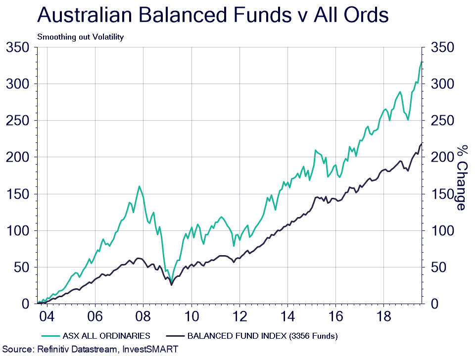
The chart below shows the total return of the average balanced fund compared to Australian shares over the last 16 years. Yes, the total return over the long run for shares is higher and it should be. But what we want to focus on is the volatility.
Our investment philosophy is based on your investment timeframe. Just imagine you were about to meet your investment goal prior to one of the major pullbacks the Australian market experienced. The realisation of your goal just got further away.
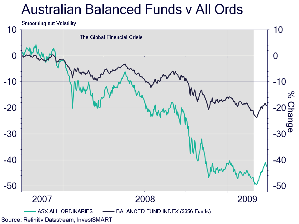
This chart shows the performance of the average balanced fund during the GFC. You can see the total decline was less than half that of the Australian market.
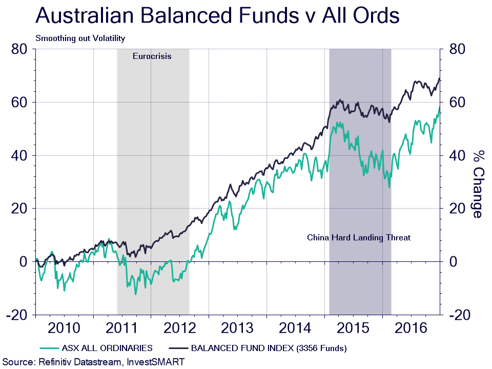
And here we can see the performance through two more recent stock market corrections.
The best investment outcomes happen when diversification is aligned with the right timeframe.
Get the diversification right with our calculators and then set up getting the right investments to make up this diversification for the lowest cost possible, hence why we have capped fees on our portfolios.
It makes sense to us.
Click here to view the InvestSMART Balanced Portfolio and click here to read Paul Clitheroe's thoughts on balanced portfolios.


Frequently Asked Questions about this Article…
The InvestSMART philosophy emphasizes diversification across asset classes to manage volatility and align with your investment timeframe. This approach helps in achieving better investment outcomes, especially during market corrections.
Over the last 16 years, a balanced portfolio has shown less volatility compared to Australian shares. While shares may offer higher total returns in the long run, a balanced portfolio provides more stability, especially during market downturns.
Investment timeframe is crucial in the InvestSMART strategy because it helps align diversification with your financial goals. By considering your timeframe, you can better manage risks and avoid setbacks during market pullbacks.
During the GFC, balanced portfolios experienced a total decline that was less than half of what the Australian market faced. This demonstrates the effectiveness of diversification in reducing volatility during major market downturns.
InvestSMART provides calculators to help investors get the right diversification for their portfolios. These tools assist in setting up investments that align with your goals at the lowest possible cost, thanks to capped fees on their portfolios.
Capped fees are important because they ensure that investors can achieve diversification at the lowest cost possible. This cost-effective approach is part of InvestSMART's commitment to providing value to everyday investors.
You can learn more about the InvestSMART Balanced Portfolio by visiting their website. They offer detailed insights and resources to help you understand how their balanced portfolio can fit into your investment strategy.
Paul Clitheroe shares his insights on balanced portfolios, emphasizing their importance in achieving stable investment outcomes. You can read his thoughts on the InvestSMART website to gain a deeper understanding of balanced investment strategies.


