Why we think Australian equities are kinky

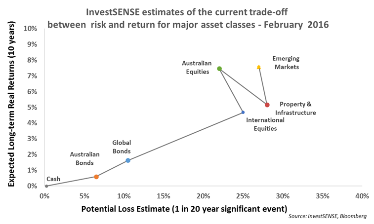
Recently, we have been observing expected returns on various asset classes and in this article, we present a chart which pulls together expected returns for the core assets within a diversified portfolio. Let us explain this graph…
We’ll start with the vertical axis which hopefully makes more sense by now. This shows expected real returns for each asset class, by ‘real’ we mean after inflation. For now most people would assume that this stands at around 2% for Australians, maybe slightly less. To understand this more clearly, 0% real return means that your purchasing power in the future remains constant. Anything above 0% means that the purchasing power of your savings will increase over time.
The second thing that you need to understand before being able to interpret this chart is that the horizontal axis represents risk. More specifically, this is our current estimate of how much you could lose when investing in each asset class if a financial crisis were to hit right now (take the GFC for instance). Markets, just like the natural world, do not follow a regular schedule. So, while 20 year floods may occur in consecutive years, you would be unlucky to experience 8 such events in an 80 year lifetime. The two axes together show the risk/return trade-off of investing in different asset classes.
With that in mind, there are four key points you need to note about this chart:
- It is upwards sloping. That means that if you invest in risky assets like equities then there is a reasonable expectation that at the end of the day (or rather the decade) you will be rewarded in the form of better returns as compared with less risky assets like bonds.
- The line is not always straight. This means that the risk/return trade-off for some assets might be out of kilter and it is important to note this when starting to think about whether to increase or reduce exposure. Australian equities represent an obvious kink upwards in the graph’s line, meaning that they represent quite good value. On this basis, we suggest having a considerable proportion of your equity exposure invested in domestic equities. It should also be noted that the domestic market is quite concentrated in a few sectors, namely banks and property, which can make it more difficult to value. That is the subject of another article entirely but for now there is still good reason not to put all your eggs in in the Australian equity basket.
- The length of the line from right to left. At the moment it is quite long and there is a good deal of space between bonds and equities. This means that we have reasonable confidence that investors in equities will be rewarded over the long term but their patience might be tested with falls of 30% or more at times.
- The length and slope of the line changes over time. The information represented in the graph has been fairly constant over the last six months, even despite the market volatility that we have seen which suggests that wholesale changes in asset allocation are not merited just yet. Again this is the subject of another entire article which will most likely make its way to your inbox next week.
These are quite tricky concepts to grasp, but markets aren’t supposed to be easy! Hopefully this gives us both a way of talking about what’s happening in markets and portfolio positioning, which we will expand on in the following weeks and months.


Frequently Asked Questions about this Article…
The vertical axis in the investment chart represents expected real returns for each asset class, meaning returns after accounting for inflation. A 0% real return indicates that your purchasing power remains constant over time.
Risk is depicted on the horizontal axis of the investment chart. It estimates the potential loss you might face when investing in each asset class if a financial crisis occurs, similar to the Global Financial Crisis.
The investment chart is upwards sloping because it suggests that investing in riskier assets like equities can lead to better returns over time compared to less risky assets like bonds.
The 'kink' in the chart line for Australian equities indicates that they offer good value, suggesting a reasonable expectation of better returns compared to other asset classes.
Investors should be cautious about investing solely in Australian equities because the domestic market is concentrated in a few sectors, such as banks and property, which can make it challenging to value.
The length of the line from right to left on the chart signifies the confidence that investors in equities will be rewarded over the long term, although they may experience significant short-term fluctuations.
The information on the investment chart has remained fairly constant over the last six months, despite market volatility, suggesting that major changes in asset allocation are not necessary at this time.
Understanding the risk/return trade-off is crucial because it helps investors make informed decisions about their portfolio positioning, balancing potential returns with the level of risk they are willing to take.


