The IPCC's terrible three
The overall message of the Intergovernmental Panel on Climate Change’s newest report is simple: a rapid shift to renewable energy is needed to avert catastrophic global warming. The science behind that message, however, is less simple.
In an attempt to make the message more clear, the IPCC’s report – produced by 1250 international experts and approved by every major government in the world – uses a number of charts to get its point across. Though the charts themselves are very complex, they provide a way to visualise increases in human-caused greenhouse gases, where those gases come from, and what they could do to our climate.
Here are three of the most sobering charts from that report.
Current efforts to reduce greenhouse gases have not been enough

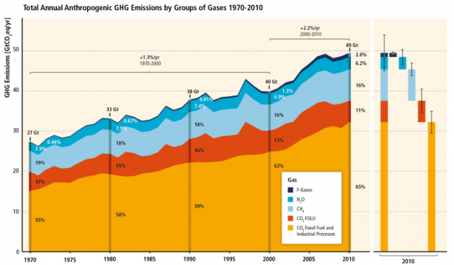
This chart shows the total amount of human-caused greenhouse gases emitted into the atmosphere every year since 1970, both from burning fossil fuels and from other industrial processes.
The visualisation makes clear that current efforts to reduce greenhouse gases by switching the cleaner technologies and renewable energy have not been enough, as global greenhouse gas emissions have been increasing by at least 1.3 per cent every year since 1970. From 2000 to 2010, those emissions were even greater, increasing by 2.2 per cent annually.
The report cites high confidence that carbon dioxide emissions from burning fossil fuels and other industrial processes contributed about 78 per cent of total greenhouse gas emission increases from 1970 to 2010, and a similar percentage contribution for the more intense increases from 2000 to 2010.
Energy supply is not the only thing driving emission increases
The circular graph above shows the percentages that different economic sectors contribute directly to total human-caused greenhouse gas emissions, while the inner circle shows how much those sectors indirectly contribute emissions through electricity and heat production. The information is from 2010, the most recent year that data is available.
While the graph shows that energy supply contributed the most to man-made global warming (responsible for 35 per cent of greenhouse gas emissions), it also makes clear that other industries are also to blame. Agriculture, forestry and other land use is responsible for 24 per cent of emissions. Industry, seemingly a description for general business production of goods, was responsible for 21 per cent, and buildings responsible for 6 per cent.
But even though industry and buildings are seemingly smaller emitters, they become larger through their indirect emissions – i.e., their use of the energy sector itself.
Big changes will be needed to avoid disaster scenarios
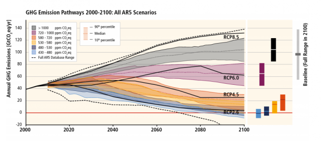
On its face, this graphic looks like it does little to simplify the climate conversation. But on closer look, it shows just how much carbon we can emit in order to avoid a scenario where the world warms by more than 2 degrees by the year 2100.
Each of the colored strips on this graph is a different emissions “scenario” that the IPCC has tested, where more emissions equal more warming. The little blue strip – representing a scenario where emissions concentrations stay between 430 and 480 parts per million of carbon dioxide equivalent by 2100 – is the one we need to strive for, the IPCC says, if we are to absolutely avoid the 2-degree warming scenario.
As the IPCC’s first report noted, continued inaction and more carbon emissions would lead to 5 degrees warming (or higher) for most of the US and Northern Hemisphere landmass, resulting in faster sea level rise, more extreme weather, and collapse of the permafrost sink.
Originally published on Climate Progress. Reproduced with permission.


