Fading illusion: A slap to the slowdown set
The recent plateau in surface temperature warming has captured headlines over much of the past year. While there have been a number of mechanisms proposed to account for the relatively slow warming since the early 2000s, a new paper by Kevin Cowtan and Robert Way published in the Quarterly Journal of the UK’s Royal Meteorological Society proposes a much more simple answer: We’ve not been measuring areas of Earth that are warming the most quickly.
The most commonly used global temperature dataset is HadCRUT, produced by the MET Office’s Hadley Centre. Hadley uses a rather simple method to estimate global temperatures: surface stations and ocean measurements are assigned to a particular grid cell on Earth that measures 5 degrees latitude by 5 degrees longitude (e.g. between 60-65 North and 40-45 West). The temperatures of all weather stations in each grid cell are averaged each month (after being converted to anomalies), and the area-weighted average of all the grid cells represents Earth’s temperature. Other global temperature datasets, for instance the one from NOAA, use similar approaches.
This method works reasonably well when all 5×5 latitude/longitude grid cells have temperature measurements available inside them. When they do not, the Hadley method ignores areas with no data coverage when calculating the global temperature. This approach in effect assigns the global average to those grid cells lacking measurements.
Data missing from earlier analyses: Arctic, Antarctica, Central Africa
The problem with this approach involves the few areas of the world where measurements are notably missing: the Arctic, Antarctica, and central Africa. Excluding measurements from the Arctic in particular poses problems, as areas around the Arctic that do have measurements are some of the fastest warming regions on the planet, with temperatures rising 2 to 3 degrees in just the last 30 years.
To address this coverage gap, Cowtan and Way came up with a rather clever strategy. They noticed that while surface measurements are spotty in many areas, there are satellite data over the past 30 years providing temperatures in the lower atmosphere and therefore nearly complete global coverage. The atmosphere is not the same as the surface, so in the past it has been difficult to use satellite measurements to directly fill in areas with missing surface measurements.
Cowtan and Way realised that although satellites might not give good estimates of surface temperature directly, they provide much more accurate estimates of how temperature varied from place to place. It turns out that if the satellites estimate that an area 10 miles away is about 2 degrees colder than a current location, something quite similar will be seen in the data from weather stations 10 miles away. By using the surface measurements for specific locations and using the spatial variance from the satellites to fill in missing regions each month, they discovered that they could create an accurate estimate of temperatures in areas with few or no direct temperature measurements available. They used a statistical method called Kriging (previously applied to land temperatures by the Berkeley Earth group) to interpolate the surface measurements based on the satellite field.

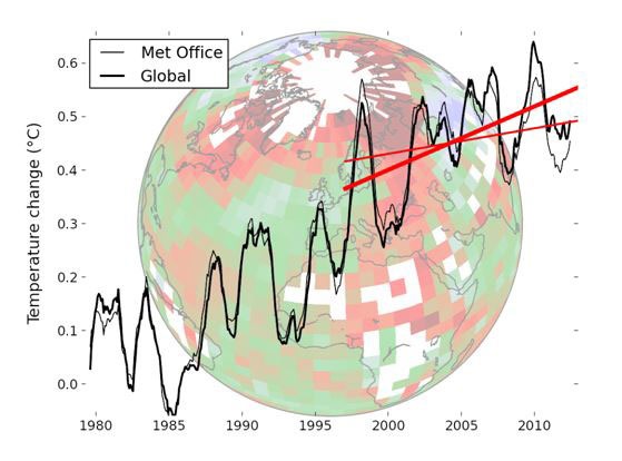
The figure above shows the new global temperature estimate from Cowtan and Way (the thick line marked “global”) compared to the current estimate from the Met Office’s Hadley Centre. The globe that the graph is superimposed upon shows an image of the 1979-2012 trends of the Hadley dataset, highlighting missing areas in white. In particular, the Arctic stands out as a white area of no measurements surrounded by grid cells showing high rates of warming. In the new temperature estimate there is no longer a notable slow-down compared to the past warming trend.
They produced a YouTube video providing a brief visual explanation of their approach, showing the world’s temperature before and after those areas lacking data are filled in. The paper has been generally well received by the climate science community, and the authors have taken the time to respond to questions on various blogs and have created a detailed Q&A and background website to help readers understand their approach and answer questions and criticisms. In addition, they have released all of their code and data for others to run.
New estimates of global heat balances
The recent IPCC report also addressed the warming slow-down in detail. IPCC in the Fifth Assessment Report (AR5) took a thorough look not only at surface temperatures, but also at temperatures of the upper ocean, deep ocean, ice, and land.
Despite their popularity as a measure of global warming, surface temperatures provide a very incomplete picture of what is going on in Earth’s climate. Air holds much less heat than water or rock, and measurements of air temperatures capture only a small portion of the energy flows. The figure to the right, from the report, shows the total energy accumulation by Earth between 1970 and 2010 across all major areas. The atmosphere is represented by the tiny sliver at the bottom, with the oceans absorbing the vast majority of the extra heat captured by growing concentrations of atmospheric greenhouse gases.
Using this much more comprehensive metric of global warming, no warming slow-down is evident, though the uncertainty is somewhat higher when measuring oceans than when measuring air. As more instruments are deployed to measure deep ocean temperatures, scientists likely will narrow the uncertainty going forward and increasingly start using global heat content in addition to surface warming as a measurement of Earth’s changing climate.
Climate models still running a bit high
As discussed in the Yale Forum’s earlier article on the recent warming slowdown, the divergence between surface temperature observations and the projections of climate models is in many ways more notable than any “pause” in warming. Over the last decade models projected that warming would accelerate compared to the prior 30 years, while measurements (even with the revised data from Cowtan and Way) don’t show any acceleration in warming.
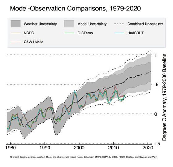
The figure below shows a comparison of temperature records from different groups (NASA’s GISTemp, NOAA’s NCDC, Hadley’s HadCRUT4, and the new Cowtan and Way approach – C&W Hybrid) to the 42 climate models included in the latest IPCC report (referred to as the CMIP5 model runs). The dashed lines, labeled Combined Uncertainty, represent the 95th percent confidence intervals (two standard deviations) of the CMIP5 runs, and includes both weather uncertainty due to short-term variability in the models and model variability due to longer-term differences in sensitivity.
The new results from Cowtan and Way are somewhat closer to the model average, but they are still a bit low. However, the period involved is short enough that it is difficult to draw any firm conclusions, and a return to El Niño conditions or a string of warm years might well serve to push temperatures back up to the model mean. Even a brief dip below the bottom dashed line would not be too unusual, as one in 20 years should still be expected to fall outside the 95th percent confidence intervals.
The next few years will be important in helping scientists determine if the recent slow-down in warming is a minor fluctuation or something more significant that might pose a fundamental challenge to understanding Earth’s climate.
Zeke Hausfather is a a data scientist and senior researcher with Berkeley Earth.
Originally published on The Yale Forum on Climate Change and The Media. Reproduced with permission.


