Demystifying the demand death spiral
While I was at the All-Energy conference in Melbourne, there seemed to be one topic that captured people’s imagination – the 'Declining Demand Death Spiral'. Regular readers of Climate Spectator will be well aware of how Australia’s electricity demand has experienced a noticeable decline, when much of the electricity industry has operated on an assumption of permanent steady growth.
Many of those representing the old school of the energy game have suggested it must be simply a temporary aberration of the global financial crisis and the weather. The demand reduction was just industry curtailing production, and did not signify any significant or permanent impact from household energy efficiency or solar PV. In the end electricity demand and economic growth were two peas in a pod, these old, wisened men proclaimed. Electricity demand would have to resume its growth if economic growth were to continue. I heard this claim just last week while I was at a conference in Canberra.
About a year and half ago it was hard to say whether they might be right or wrong. Then, the data available publicly was sketchy and incomplete. But slowly and steadily pieces of the demand decline puzzle are dribbling out from assorted sources. We now know the old-school men are wrong, and we’ll illustrate this in some charts of the week.
Yes, there have been some important reductions in industrial load. AEMO data shows that industrial electricity consumption has declined from a peak of 41.2 terrawatt-hours in 2007-08 to 38TWh in 2012-13.
But residential demand reductions from energy efficiency as well as solar PV have most definitely had an impact, too. And demand has just continued to decline in the NEM in spite of economic growth recovering to levels similar to those the decade preceding the GFC. What’s really interesting is demand in the Western Australian electricity market has been pretty stagnant in spite of outstanding economic growth. Furthermore, we had the hottest summer on record, yet peak demand was well below the levels of just a few years ago.
At the All-Energy conference Mike Swanston from Energex gave an excellent presentation illustrating how Solar PV is making a material difference to electricity demand in their neck of the woods. It also showed that demand reductions in Queensland are most definitely a residential phenomenon, not one solely of a GFC-induced business downturn.
The two slides below taken from Swanston’s presentation illustrate that in Energex’s network there has been an unmistakable year-on-year decline in average residential household demand since 2009, while demand from businesses hasn’t changed much at all.
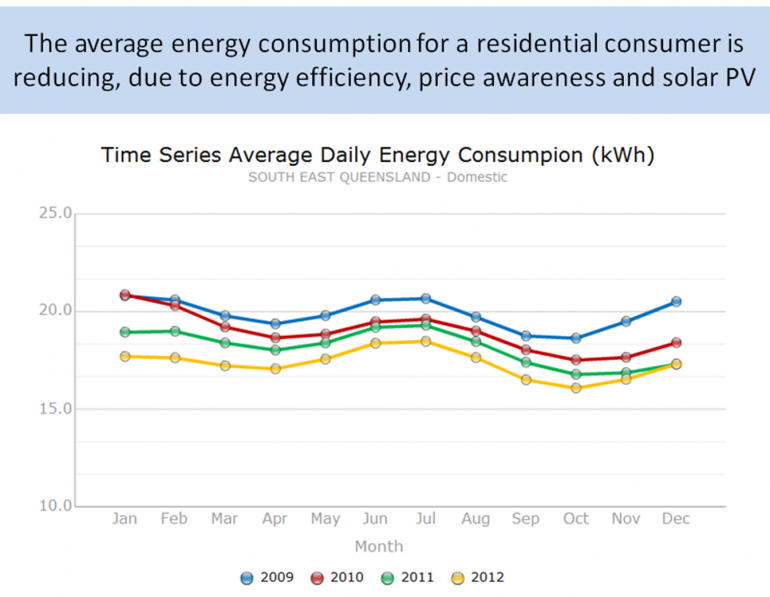
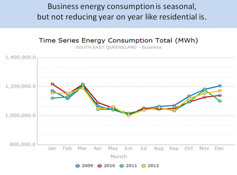
Source: Mike Swanston – Energex (2013): The Case for Change – The New Normal for Distribution Networks
Energex aren’t the only ones seeing a clear and obvious decline in residential electricity demand. Energy retailers Origin Energy, Energy Australia and AGL Energy have all reported declines in household consumption in the residential sector.
The chart below illustrates what has been happening with AGL’s customers by state. New South Wales customer demand is reasonably steady but Queensland customer demand has dropped noticeably, as has South Australian demand since October 2010. Victoria’s demand has dropped as well, although more slowly.
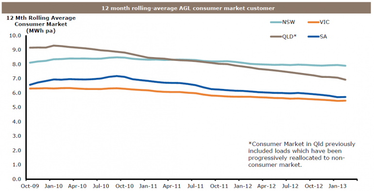
Source: Paul Simshauser, AGL Energy Market Update Falls Creek, Victoria, 31 May 2013
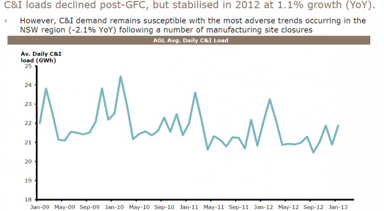
Meanwhile, in terms of commercial and industrial AGL observed in a presentation (slide below) that demand has stabilised in 2012 after the GFC drop away.
Some other interesting data about changing demand patterns have also dribbled out. The chart below from Mike Sandiford which we published several months ago, illustrates a discernable fingerprint on South Australian overall demand by time of day from the rapid growth of solar PV. A similar clear solar fingerprint is evident in Queensland’s demand.
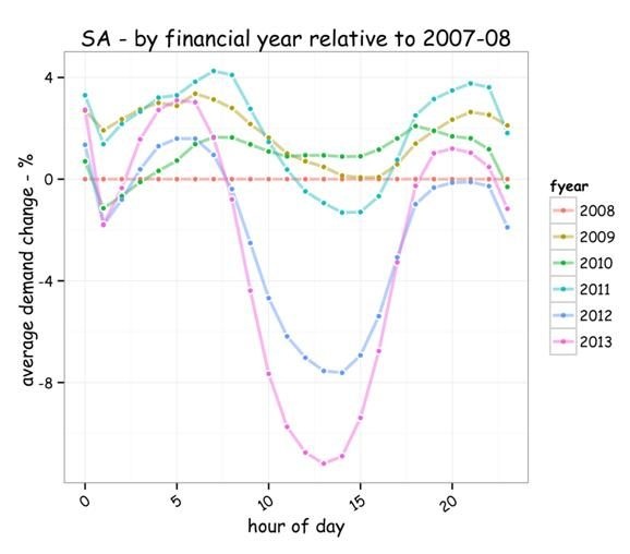
Source: Mike Sandiford, Melbourne Energy Institute (2013)
Other titbits of information have also emerged from SP Ausnet indicating that energy efficiency standards for new homes are also impacting on energy demand.
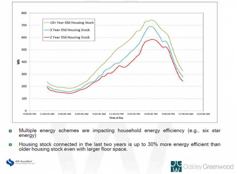
Source: SP Ausnet and Oakley Greenwood – Improving energy forecasting at SP AusNet
The picture is still very much incomplete about precisely what is driving changes in demand, but we can be reasonably confident that residential energy efficiency efforts are making an impact. Still, considering how much political and policy emphasis is placed on carbon emissions and energy prices, we really should have much better information about what it going on. Otherwise we’ll continue to be led astray by old men dependent on out of date experience, instead of real world data.


