Bitcoin, bubbles and maths


Summary: On a standard price graph, bitcoin's price surge this year is phenomenal. But whether the crypto currency is a bubble waiting to pop needs to be taken in the context of how data can be plotted over the long term.
Key take-out: Understanding the way long-term returns are distorted on a graph when a linear scale is used, and the way a log scale can be useful in examining long-term data, can assist an investor in making use of graphs as investment tools.
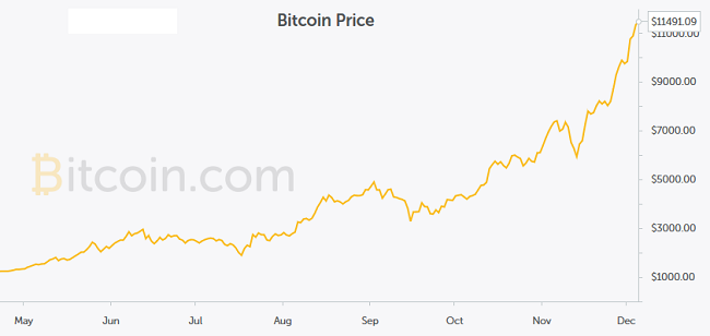
As the price of bitcoin has shot through $US10,000, and then $US12,000 on Thursday, the topic of a possible bubble in the bitcoin price is tossed around pretty freely.
Bitcoin being compared to the great bubbles in history, from tulips in the 1630s to the more recent dot com bust.
One of the first places that people start to look for evidence of bubbles is around the graph of the price of an asset, and there is no question that the graph of the bitcoin price has a look of bubble about it.
Source: Bitcoin
Long-term graphs and ‘bubbles'
With the easy access investors now have to generating graphs of the returns of different assets, it is important to think about how they are being used. I often come across people who are concerned about bubbles when they generate a long-term graph around an asset, for example looking at the long-run return from Australian shares. I think this can be a function of using the wrong type of graph, rather than there being an actual bubble.
There are two common scales that can be used on a graph: a ‘linear' scale and a ‘logarithmic' (log) scale. The most common is the linear scale. However, in my experience, logarithmic scales are almost always available as a choice on the graphing options I have seen on financial websites and research sites. A linear scale has equal dollar increments on the vertical axis – for example, on the bitcoin graph, every hypothetical $2000 increase in the bitcoin price is equal. On a logarithmic graph, the vertical axis measures equal percentage gains.
The following example sets out to show why using a linear scale makes long-term investment data look more like it might be in ‘bubble territory', and why using a log scale provides useful information around long-term investment performance.
Why a ‘normal' graph looks like a bubble over long time frames
Let's consider what happens with a hypothetical asset, shares in a company, that performs roughly in line with the average expectations of a share market investment over time – providing a total return (dividends and price growth) of 10 per cent a year.
This is not too different from 100-plus year average returns from the Australian sharemarket, although in this case we have assumed fairly steady returns when we know that the reality would see more volatility of returns.
To simplify calculations, we will use an interesting investment rule of thumb, the ‘rule of 72'. The ‘rule of 72' says 72 divided by the average annual return gives you the amount of time it will take for an investment to double. In this case, assuming a 10 per cent per annum return, the value of this investment should double about every seven years (approximately 72/7). $10,000 invested into our hypothetical company would see a return as follows:
|
Year 0 |
$10,000 |
|
Year 7 |
$20,000 |
|
Year 14 |
$40,000 |
|
Year 21 |
$80,000 |
|
Year 28 |
$160,000 |
|
Year 35 |
$320,000 |
If the underlying earnings of our hypothetical company increase in line with the share price over time, then these returns seem reasonable. As a comparison, $10,000 invested into an investment that matched the average return generated by the Australian share market in 1975 (with dividends reinvested) had turned into $1,097,000 after 35 years (the average annual return over this period was just over 13.5 per cent per annum, above our 10 per cent per annum assumed return).
When we come to graph our ‘hypothetical asset' using a linear scale (with each unit on the y-axis being a $50,000 increase) we can see that rather than showing an asset that is increasing in price in a fairly orderly and steady fashion, it provides the sort of graph that might have investors concerned about a ‘bubble' in that asset.
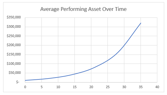
Source: Eureka Report
However, if the graph is drawn using a log scale, in this case with each interval showing a 10x increase in price, the results are very different. The resulting graph is a straight line, reflecting the fact that the percentage increases in the value of the hypothetical asset have been steady over time.
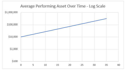
Source: Eureka Report
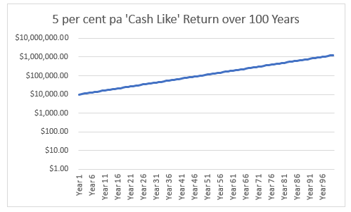
Even a cash-like return can become ‘bubble like'
To demonstrate the way long-run returns can become distorted, I have assumed another scenario: $10,000 invested into a 100-year term deposit that pays 5 per cent per annum. While we would love to be receiving 5 per cent on our cash investment in this period of low cash rates, it is a historically reasonable assumed rate of return for a cash investment.
The following graph shows that using a linear scale, even a cash rate of return can start to have the look of a bubble about it over a long enough time frame.
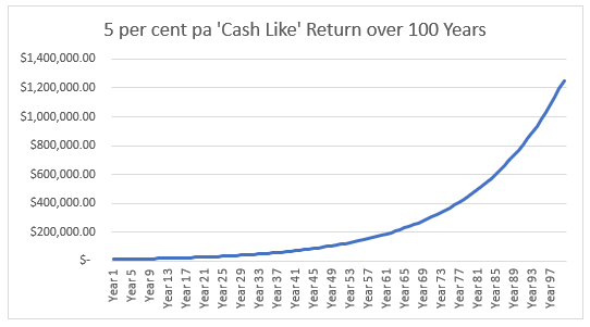
Source: Eureka Report
The use of a log scale immediately makes the graph reflect the steady percentage increase in the cash investment over time.
Source: Eureka Report
Using some ‘real world' data
The following graph looks at total returns from the Australian share market from 1970 through to 2017. We are all acutely aware that the last 10 years of returns in the Australian market have not been great – and indeed, with major indices currently around the 6000 mark, they are 10 per cent below their peak from 10 years ago.
Even with that said, the linear scale graph of returns over this period of time does seem to show an increasingly steep graph from about 1995 onwards, which may well concern some investors.
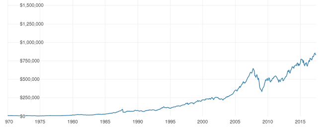
Source: Vanguard
When we adjust the setting of the graph to use a logarithmic scale, where each unit on the vertical axis shows a consistent percentage increase, we see a very different looking graph – instead of a sharp increase in the last seven or so years of the graph, it actually flattens out somewhat – consistent with the post GST period of modest returns.
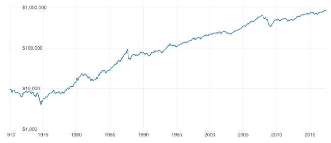
Source: Vanguard
Back to the graph of the bitcoin price
In the other graphs we have looked at, changing to use a logarithmic scale has made the graph look far more reasonable. The following graph of the bitcoin price uses a log scale, and still shows a relatively steep increase in recent times.
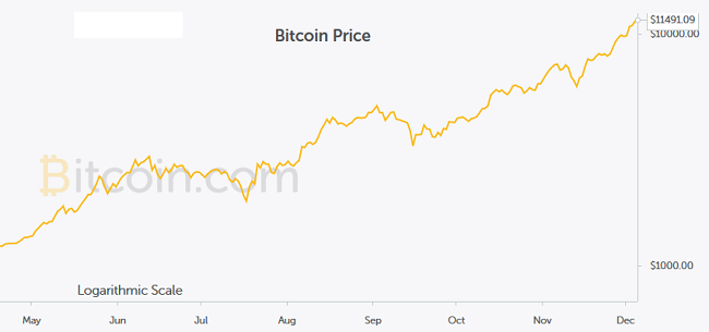
Source: Bitcoin
Conclusion
Graphs provide a significant amount of information to investors, and are readily available. Understanding the way long-term returns are distorted on a graph when a linear scale is used, and the way a log scale can be useful in examining long-term data, can assist an investor in making use of graphs as investment tools.
In terms of the bitcoin price, individual investors are lucky in that, in this modern day, we can access investment instruments that allow us to take a position to benefit from either an increase or a decrease in the price of many assets, including the bitcoin price.
In this case, keeping economist John Maynard Keynes' advice in mind that “markets can remain irrational longer than you can remain solvent”, I am happy to sit on the sideline as an interested spectator and see whether or not bitcoin ends up as another historical example of an asset price bubble.


Frequently Asked Questions about this Article…
Using a logarithmic scale in investment graphs helps investors see consistent percentage increases over time, providing a clearer picture of long-term performance without the distortion that can occur with a linear scale.
Linear scale graphs use equal dollar increments, which can exaggerate the appearance of growth over time, making investments look like they are in bubble territory, especially when viewed over long periods.
Understanding graph scales can help everyday investors make more informed decisions by accurately interpreting long-term investment data and avoiding misconceptions about potential bubbles.
The article suggests that while Bitcoin's price surge resembles historical bubbles, using a logarithmic scale still shows a steep increase, indicating that it might be in bubble territory, but this is not definitive.
The 'rule of 72' is a simple way to estimate how long it will take for an investment to double, by dividing 72 by the annual return rate. It's a handy tool for investors to gauge potential growth over time.
The article compares Bitcoin to historical bubbles like the tulip mania and the dot-com bust, suggesting that its rapid price increase could be indicative of a bubble, though this is debated.
The article advises caution, highlighting economist John Maynard Keynes' advice that markets can remain irrational longer than one can remain solvent, suggesting a careful approach to Bitcoin investments.
By understanding how graph distortions occur, particularly with linear scales, investors can better assess the true performance of their investments and avoid being misled by apparent bubbles.


