The stock secrets hidden in margin debt
Last week’s column on margin debt and the US stock market confirmed that leverage plays a key role in driving movements in share markets – and vice versa. But it left one technical question unanswered for me: is the causal link between change in debt and change in asset prices, or between acceleration in debt and change in asset prices?
My logical argument was the latter. In my monetary approach to macroeconomics, aggregate demand is income (effectively gross domestic product) plus the change in debt, and this money is expended on both goods and services (also effectively GDP) plus net asset sales. Net asset sales in turn reflect the price level of assets, the quantity in existence, and the fraction of that stock that is sold over a year.
That implies a causal link between the growth in debt and asset prices, and in turn between the acceleration of debt and change in asset prices. This won’t be one-to-one – there are many other factors that come into play, and even with this one factor of credit, changes in credit can find themselves expressed in not only the price level but also the rate of growth of assets and the fraction that are sold each year. But that’s the link my approach implied: acceleration of debt causes change in asset prices.
However when I Iooked at the US margin debt data – which I’ve only just located – the strongest correlation was between the level of margin debt as a percentage of GDP and the level of share prices (0.945), then between change in margin debt and change in share prices (0.59), and finally between acceleration of margin debt and change in asset prices (0.4). So there was a puzzle.
How to resolve it? Well looking at other countries apart from the share-obsessed Americans might help, and I’ve actually had the Australian data for some time, since the Reserve Bank publishes it on a quarterly basis in its bulletin. It doesn’t go as far back as the US data, but it helps decide which matters more – acceleration or change in debt.
And of course it’s also useful if you’re currently gambling on the Australian stock market. So here goes.
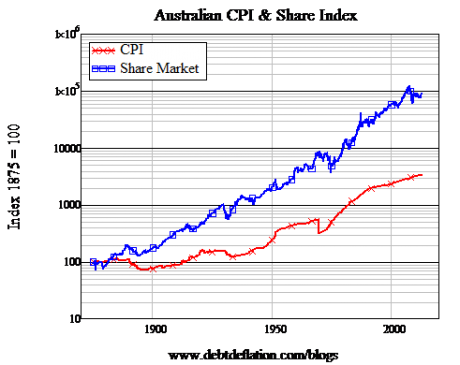
Firstly, the long-term pattern of Australian share prices versus consumer prices is closer to what I thought is justified by 'the fundamentals'. There are fundamental reasons to expect share prices to rise faster than consumer prices over time – because re-invested retained earnings will increase the value of share over time – and this is what the Australian data shows much more clearly than American figures.
Whereas the American data had only a tiny divergence between share prices and consumer prices from 1915 until 1982, and then an explosion in the relative prices, the Australian price trends have been growing apart relatively consistently since 1875 – see figure 1.
Figure 1: Australian shares and consumer prices over the long term
Why the difference? I’d speculate (intellectually speaking) that there’s less of a history of speculative bubbles in the Australian sharemarket than the US. While we haven’t been immune (remember our Poseidon adventure?), we’re less prone to gamble on share prices than the Americans. (Australians prefer gambling on bricks and mortar instead.) So the US is going to have more booms and crashes than Australia, and my data (starting in 1915) may have been affected by that.
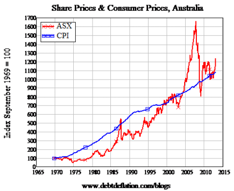
Funnily enough though, that doesn’t mean that shares are a better long-term investment in Australia than the US – at least for the current generation. Though shares have generated real returns over the very long term, anyone who bought into the share market in 1970 has done no better than they would have by buying a warehouse of spam: since 1970, the increase in share prices has been almost exactly matched by the rise in consumer prices (see figure 2).
In fact, figure 2 unfairly flatters shares – because the index is made up of the top 500 firms at any one point in time, which leaves out the negative impact of failures like Qintex and Bond Corporation on the index itself. Individuals aren’t so lucky: if you bought the ASX 500 in 1986, you bought share in Bond and Qintex, which were soon in the toilet (in one friend’s case, literally so: her Qintex share are framed in the 'loo to make 'doing the job' that much easier). So frankly, if you’d purchased a warehouse of spam in 1970, it would be worth more today than an equivalent purchase of Australian shares.
Figure 2: Not such a fabulous return in recent decades
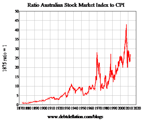
But back to the data. The ratio of Australian shares to the CPI has a more regular growth pattern than the US data – but the bubbles in 1970, 1987 and 2007 are still bleedingly obvious (see figure 3).
Figure 3
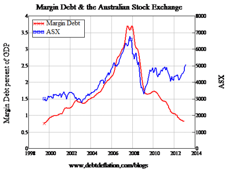
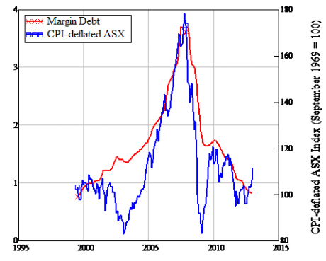
So what role has margin debt played in those bubbles? Well we can only consider the last one, since the Reserve Bank's margin debt data only goes back to 2000. But what a story it tells: have a gander at figure 4. While not showing quite the over-the-top correlation that the US data did (0.8 for the last 13 years, versus 0.945 for half a century), it’s still impressive – especially since the usual reason to discount such a correlation (that it’s spurious because both series are rising over time) doesn’t apply here.
Figure 4: Margin debt and the ASX
That tale gets stronger still when one deflates the share market index by the CPI (see figure 5): the correlation rises to 0.86.
Figure 5: Taking inflation into account
So the outright correlation of margin debt to the stock market that we saw in the US data applies in the Australian figures as well. But the story changes when we consider the rate of change of margin debt, and its acceleration.
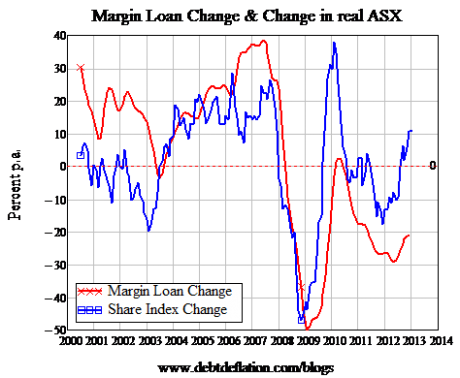
There is a correlation between rising margin debt and rising share prices, but it’s not as strong as in the US case: 0.62 over the last 13 years for Australia, versus 0.69 for the US for the same time period (and 0.59 for the last five decades).
Figure 6: Margin debt change and stock market change – Correlation 0.62
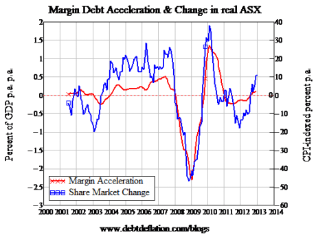
However, the correlation of accelerating margin debt with change in share prices – the one I expected to find – is stronger in the Australian case. It’s 0.81 in the Australian case, versus 0.75 in the US over the same time period.
Figure 7: Margin debt acceleration and change in the ASX – Correlation 0.81
So in a real exception for me, Australian data seems closer to my expectations than the United States'. I’m used to Australia being the exception to my rules – for once that doesn’t seem to be the case.
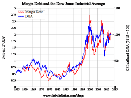
So what does this all imply for the current bubble in the Australian stock market? On the data, it looks less fragile than the one in the US. Figure 8 is a reminder of the US data from last week: the US market is only about 10 per cent below its all-time peak now, and margin debt is about 30 per cent below. It can rise, but I think that’s a pretty fragile peak – especially given how flat the US economy is now compared to its dynamism back in 2000.
Figure 8: US margin debt and stock price data
The Australian data is very different on both fronts. Even with the recent rally, the index is something like 60 per cent below its more recent 2007 peak, and margin debt is way down on its levels back then – under 1 per cent of GDP versus close to 4 per cent in 2007. So the Australian stock market rally doesn’t look as fragile as the US one does – certainly it appears to have less danger of a positive feedback loop between falling prices and falling margin debt.
That’s not to say that it’s not a gambler’s den, and one with a credit card inside the casino to boot. Though this cross-country comparison has shown ways in which the two markets differ, it confirms my general thesis that leverage is a key driver of the so-called 'wealth effect'. It’s really the leverage effect, and it’s insane to base the future prosperity of any society on the outcome of a leveraged gamble on asset prices. On that note, I can do no better than to quote Keynes’s brilliant prose from the 1930s:
"Speculators may do no harm as bubbles on a steady stream of enterprise. But the position is serious when enterprise becomes the bubble on a whirlpool of speculation. When the capital development of a country becomes a by-product of the activities of a casino, the job is likely to be ill-done. The measure of success attained by Wall Street, regarded as an institution of which the proper social purpose is to direct new investment into the most profitable channels in terms of future yield, cannot be claimed as one of the outstanding triumphs of laissez-faire capitalism – which is not surprising, if I am right in thinking that the best brains of Wall Street have been in fact directed towards a different object."
Steve Keen is professor of economics and finance at the University of Western Sydney and author of Debunking Economics and the blog Debtwatch. His Minsky Kickstarter page is here.


