What's caused the drop in brown coal power?
One of our frequent readers asked us a question a couple weeks ago as to what’s caused the drop in brown coal production (whether, for instance, the drop in brown coal production is attributable to the carbon price).
We’ve had some time to prepare these additional pieces of analysis to show how output (and capacity factor) of the brown coal stations in Victoria and South Australia has trended over time – each is analysed below:
1) Yallourn Power Station (VIC)
The following chart from NEM-Review highlights how the output in Yallourn has trended since the start of the NEM (now more than 14 years ago).

We can see in the chart how output dropped at Yallourn from June 6 2012 as a result of the flooded mine that set back available capacity significantly, through till early August.
These levels increased following restoration of coal supplies but not back to prior levels following EnergyAustralia’s decision to withdraw one unit from the market (decision taken in October whilst the unit was returned to service in January).
The carbon tax would have had some impact in taking this decision – though it seems also likely that the decision would have been taken in the light of the company’s increased portfolio spread (with the addition of the Wallerawang and Mt Piper gentrader contracts) and the ongoing emerging surplus of capacity in the market, due to declining demand. We’re not in a position to gauge the relative significance of these three (and any other) factors in the decision.
2) Hazelwood Power Station (VIC)
At the Hazelwood Power Station (the oldest, and most carbon-intensive of the big four stations in Victoria) we see that the plant has continued to run at close to full capacity factor (taking into account unit outages for maintenance) since the introduction of the carbon tax.

There is no easily discernable difference in dispatch patterns compared to that seen in the prior 13 years of NEM operations.
3) Loy Yang A Power Station (VIC)
At Loy Yang A we see that there has been a slight drop in the capacity factor of the station that occurred after the introduction of the carbon tax.

However, as full ownership of the plant (and operational control) passed to AGL Energy in late June 2012, it is probable that some of this change is attributable to portfolio effects (i.e. part of a larger portfolio, hence able to be run more strategically in conjunction with the other assets in the portfolio).
Once again, it is not possible for us to definitively state the degree to which each factor has contributed.
4) Loy Yang B Power Station (VIC)
At Loy Yang B (the brown coal station with what’s generally understood to be the lowest short-run marginal cost) there is no perceptible change in output since the carbon price has been introduced:

5) Morwell (Energy Brix) Power Station (VIC)
In contrast, the carbon tax is seen to coincide with the almost full curtailment of output at the smallest of the five brown coal plants in the Latrobe Valley.

Problems at the plant?
6) Northern Power Station (SA)
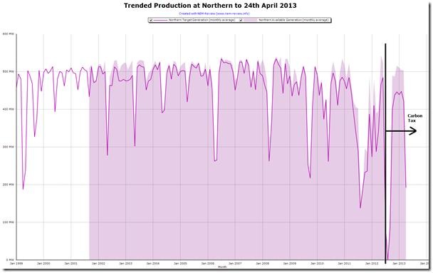
Crossing the border into South Australia, we see how output at Alinta’s Northern Power Station has been trending downwards for a number of years on the back of declining demand and the increased substitution of wind production for production from thermal plant.
This led to the withdrawal of the station from the market for six-month periods April to September.

Alinta took the time to note here that the seasonal withdrawal of Northern’s capacity was made:
“…based purely on market conditions as Alinta Energy is not receiving adequate market returns to operate during those months. The decision is not being made because of the price on carbon.”
We see that, even on its return-to-service for October 2012 to March 2013 its production levels were lower than they had been in prior years.
Of course, WattClarity readers will have a diversity of their own points of view with respect to the above.
7) Playford Power Station (SA)
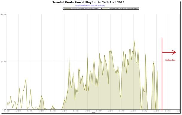
Last but not least, here’s a chart for Alinta’s Playford plant in South Australia, which highlights how the plant had been challenged for a long time prior to the introduction of the carbon price:
In summary, we’ve previously shown how it’s black coal-fired production that has been crunched more significantly in recent years.
There has been some reduction in brown coal-fired production – which is examined in more detail above. This analysis highlight how it is difficult (if not impossible) in a complex system such as the NEM to tie back outcomes to a single cause and definitively state things such as ‘the output of brown coal plants has declined because of the carbon tax.’
That said, the carbon price will have had some effect – along with declining demand, increased production from wind in the south and gas in Queensland, portfolio changes and other factors. It’s not possible for us to rank these factors in order of significance.
This article was originally published by Watt-Clarity, Republished with permission.


