Six charts that show how difficult decarbonising the UK really is


Despite a surge in renewables and plummeting energy use the UK remains a long way from the green energy champion it must become if it is to reach its ambitious climate targets, new data from the department for energy and climate change shows.
Last week DECC published the 2013 version of its annual energy data bible DUKES, the digest of UK energy statistics. It's a veritable gold mine of fascinating stories about who's using the most energy and where it comes from.
We already took a sneak peak at provisional data back in February that showed electricity from wind on the up, but coal and gas still dominating. Now with the help of the final stats, here are six charts that give you the big picture of the UK's progress towards a greener energy future.
1) It's using less energy than it did in the 70s even though it's three times richer
Total UK energy use reached a peak in around 2000 then plateaued. In 2005 it started to fall, as the grey line in the chart below shows. Since then energy use across the UK has fallen by 13 per cent at an average rate of 1.7 per cent per year.
Some of that's down to the longest recession since the 1930s – the dip and slow recovery in GDP shown in blue – but energy use was already falling before the crisis hit.
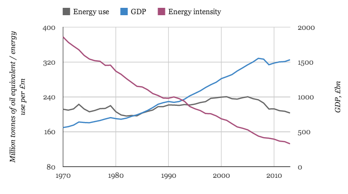
Source: DUKES table 1.1.4
Overall the UK is now three times richer than it was in the 1970s, but despite that, energy use is at 1970s levels. In other words it's generating a lot more wealth for every unit of energy it uses, as the falling purple energy intensity line above shows.
To reach its ambitious 80 per cent emissions reduction target for 2050 the UK either needs to keep on rapidly reducing the energy intensity of the economy – or it needs to get much more of its energy from low-carbon sources like renewables or nuclear.
2) Almost all its energy still comes from fossil fuels
Unfortunately, despite some progress, we haven't done too well on that second option. In 2013 fossil fuels provided the vast majority – 86 per cent – of UK energy needs. Coal (19 per cent), oil (32 per cent) and gas (35 per cent) are shown in shades of blue in the chart below. That's down from 90 per cent in 1990 and 96 per cent in 1970.

Source: DUKES table 1.1.1
Low-carbon energy sources, shown in shades of pink and purple, provided 13 per cent of total UK energy needs in 2013. Much of this came from nuclear (7.5 per cent) and bioenergy (4.3 per cent) with renewables making up a tiny 1.5 per cent share.
3) The UK doesn't make anything any more but Brits are flying a lot more often
That puts the spotlight back on reducing energy use. So who's using the most energy? Back when the UK had a manufacturing base and the Austin Allegro was the height of cool, industry used nearly half of all energy (light blue area below). The rest was split between homes (dark blue) and transport (shades of pink).
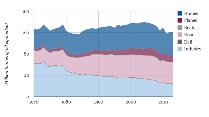
Source: DUKES table 1.1.5
Since then the bottom has dropped out of industrial energy use as energy-intensive industries like steel manufacturing closed down. Domestic energy use has remained relatively steady, despite a rising population, and like total energy use has now started to fall. We explored why that might be here.
In contrast to falling domestic and industrial energy use transport has grown fast and now takes the largest bite of total energy use. That's thanks to huge growth in road travel, although the number of miles travelled has started to drop off recently. Another big factor has been the rise in air travel driven by budget airlines.
This chart demonstrates why getting electric cars on the road – there are only 10,000 today – is so essential to hitting future climate targets.
4) Coal and gas still dominate but renewable electricity is on the up
But just switching to electric cars won't cut emissions unless the electricity used to charge them comes from low-carbon sources of power.
Overall the UK is not doing too well on that front either, as the chart below shows. Most of its electricity in 2013 came from coal (41 per cent) and gas (23 per cent), shown in blue lines below. There are some encouraging signs here, however, with renewable electricity production growing rapidly in recent years – up to 12 per cent in 2013 (purple line).
Together with nuclear (pink line), low carbon electricity accounted for 32 per cent of the total in 2013. So a third of electricity is low carbon.
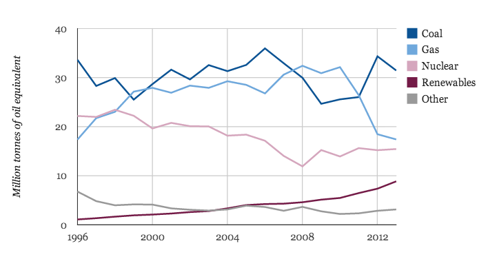
Source: DUKES table 5.3
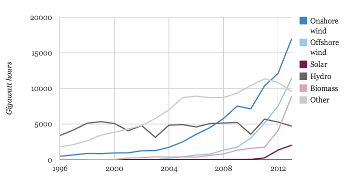
5) The number of wind farms, solar panels and biomass plants has rocketed
Why has renewable electricity output grown so much? The answer lies in the huge surge in installed capacity of wind, solar and biomass plants.
In the five years to 2013 onshore wind capacity tripled (dark blue line, below) while offshore wind grew six-fold (light blue line). Over the same period solar (purple line) grew to 120 times its 2008 capacity, although it's unlikely we'll see that staggering rate of progress continue.

Source: DUKES table 6.4
There was also rapid growth in the capacity of power stations burning wood to produce electricity (pink line). This includes coal-fired power stations like Drax in Yorkshire that has part-converted to burn biomass instead.
A DECC study shows the carbon emissions from burning biomass can be worse than burning coal unless the wood is carefully sourced and makes use of waste wood rather than burning whole trees. But for now it is assumed to cut carbon.
6) Most renewable electricity comes from wind and biomass
We had better hope that wood sourcing is being done carefully, because biomass plants produce a disproportionately large share of the electricity generated from renewable sources (pink line below).
That's because biomass plants can generate power almost all of the time. In contrast wind (blue lines) and solar (purple line) only generate electricity when the wind blows or the sun shines. Of the two, wind has a higher 'capacity factor' than solar – which is why wind is such an important part of the renewable electricity mix.
Source: DUKES table 6.4
These charts show the huge scale of the challenge if the UK is going to reach its climate goals. There will need to be continued energy use efficiencies and we'll need to find a way to replace most of the 86 per cent of our energy that comes from fossil fuels.
That will require many more wind turbines and solar panels, and probably an electric car revolution, a shift away from gas boilers for home heating plus some combination of biomass, nuclear and carbon capture and storage. It's a big ask.
Originally published by Carbon Brief. Reproduced with permission.


