Charting the way to a Reserve Bank reversal
The Reserve Bank Quarterly Statement on Monetary Policy always allocates a considerable amount of space to global economic and financial market conditions. The SOMP from last Friday seems to have ramped up the analysis of global conditions a touch more than usual, with a comprehensive assessment of where the world and the different parts of it are going.
The SOMP includes some wonderful graphs on various aspects of the global economy and several of the more interesting ones are set out below.
As the charts show, the current global economic softness is one reason why the Reserve cut interest rates to 2.5 per cent earlier this month.
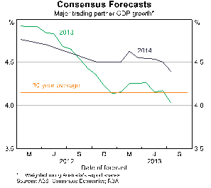
Since the start of 2012, there has been a fairly consistent downgrade to the global GDP growth outlook. Some 18 months ago, the consensus forecast was that Australia’s major trading partners would expand by nearly 5 per cent in 2013 but growth is now forecast to rise by just 4 per cent. From the start of 2013, Australia’s major trading partner GDP outlook for 2014 has been scaled back, albeit less dramatically than the year before. It seems the Reserve has concern that these downgrades will either continue or hurt the economy.
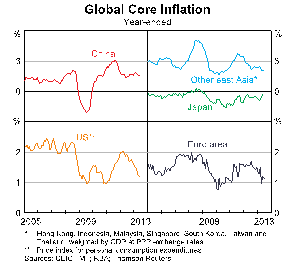
As an inflation targeting central bank, the Reserve is clearly interested in, and swayed by, global inflation trends. Other than in Japan where the Abe administration is striving to reflate the economy, inflation is decelerating and is low. It would be very odd if Australia did not get caught up in and suffer from these disinflationary impulses.
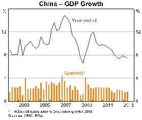
The slowing in China has been marked. GDP growth has been on a steady path lower since the fiscally charged post-crisis rebound in 2009. Having got used to GDP growth rates in double digits from about 2000 to 2007, the new normal for China seems to be growth near 8 per cent and will probably be less as the Chinese economy matures.
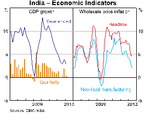
While the outlook for Japan is improving, there is a marked deterioration in conditions in the world’s third largest economy, India. GDP growth has faltered to a 3 per cent pace and the double problem of wide current account and budget deficits have seen its credit rating downgraded to just one level above junk. This weakness has sparked a sharp deceleration in inflation which has given some scope for the Reserve Bank of India to easy monetary policy, but the outlook for India is not particularly robust.
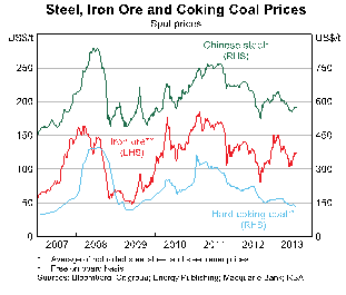
Reflecting the global performance, the Reserve Bank then has a series of charts on commodity prices, the most telling being for Chinese steel, iron ore and coal. Most striking of these is the dismally low price for coal. According to the Reserve, the price of hard coking coal is near its lowest point in six years and the price momentum is clearly down. At the same time, there is some encouraging news with the Chinese steel and iron ore price which appear to be edging higher, despite the softer global conditions outlined earlier.
Another particularly powerful chart is Australian export volumes. The Reserve Bank split exports into four categories – resources, services, manufacturing and rural. Quite clearly, the slope of the line for resources and rural exports has been strongly positive, which is no surprise. It is also no surprise that over the past five years or so, services exports (tourism and education mainly) have been falling quite sharply. This is the strong and over-valued Australian dollar taking its toll. Manufacturing export volumes, somewhat surprisingly, have been resilient after taking a hit during the crisis in 2008 and 2009.
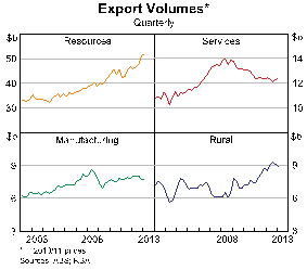
In looking at the chart of export volumes, the scale is important. Resources export volumes totalled more than $50 billion in the March quarter, roughly four times more than services, five times more than rural and seven times more than manufacturing. This means that the sharp rise in resources exports has swamped the softening in services and manufacturing over recent years.
The key point about these charts and the bulk of the analysis that accompanies them are backward looking. They show how global growth has slowed, with lower inflation and a mixed record on commodity prices.
The trick now is to work out when these trends will turn – which they inevitably will. And with what force will they change?
Given the huge amounts of unconditional monetary stimulus in the world at present, it seems fair to think that the turning point is near. The recovery in Japan was confirmed yesterday with news of a lift in GDP, while the run of data from China late last week is unambiguously more favourable. The US is on a path of self-sustained recovery which is likely to lift the world with it.
It will be interesting to see the charts on global growth, inflation and commodity prices in a year’s time. It would be very surprising if there was not a change in the direction for all of them.


